This November 8th, even if you manage to be registered in time and have the right identification, there is something else that could stop you from exercising your right to vote.
The ballot. Specifically, the ballot’s design.
Bad ballot design gained national attention almost 16 years ago when Americans became unwilling experts in butterflies and chads. The now-infamous Palm Beach County butterfly ballot, which interlaced candidate names along a central column of punch holes, was so confusing that many voters accidentally voted for Patrick Buchanan instead of Al Gore.
We’ve made some progress since then, but we still likely lose hundreds of thousands of votes every election year due to poor ballot design and instructions. In 2008 and 2010 alone, almost half a million people did not have their votes counted due to mistakes filling out the ballot. Bad ballot design also contributes to long lines on election day. And the effects are not the same for all people: the disenfranchised are disproportionately poor, minority, elderly, and disabled.
In the predominantly African-American city of East St. Louis, the race for United States senator in 2008 was missing a header that specified the type or level of government (federal, congressional, legislative, etc.). Almost 10 percent of East St. Louis voters did not have their vote counted for U.S. Senate, compared to the state average of 4.4 percent. Merely adding a header could have solved the problem. Below you can see the original ballot and the Brennan Center redesign.
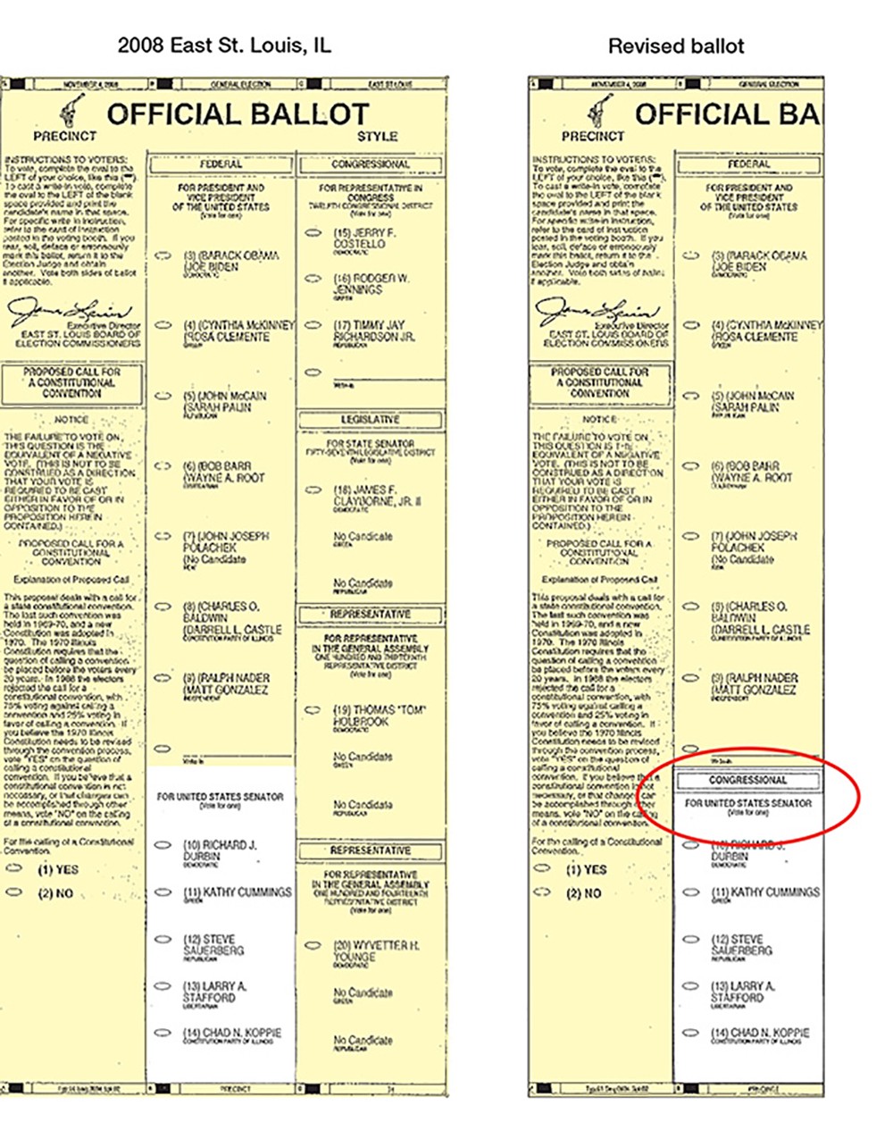
(Photo: Brennan Center/Better Design Better Elections)
“When we design things in a way that doesn’t work for all voters, we degrade the quality of democracy,” said Whitney Quesenbery, a ballot expert and co-director of the Center for Civic Design, an organization that uses design to ensure voters vote the way they want to on Election Day.
Many Mistakes Can Be Avoided With Tiny Tweaks
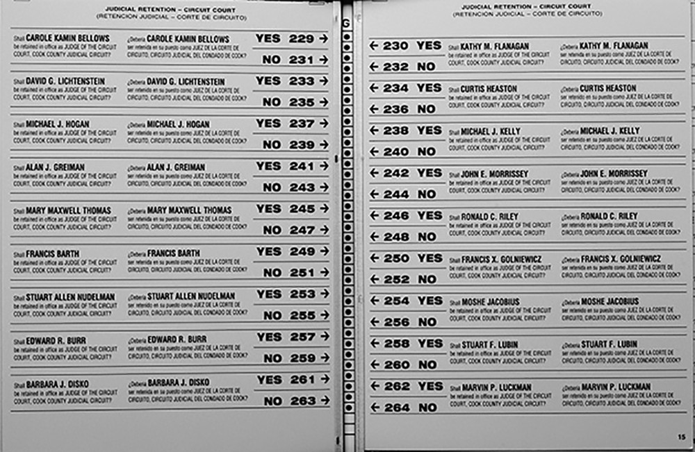
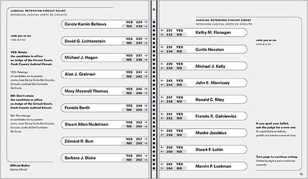
Designer Marcia Lausen, who directs the School of Design at the University of Illinois–Chicago, wrote a whole book about how democracy can be improved with design. She even tackles the infamous butterfly ballot. The 2000 Chicago Cook County judicial retention ballot crammed 73 candidates into 10 pages of a butterfly layout punch card ballot, with punch holes packed much more tightly together than in previous elections. As in Palm Beach, yes/no votes for the candidates on the left page were confusingly interlaced with yes/no votes for the right page.
Lausen’s proposed redesign eliminates the interlaced yes/no votes, introduces a more legible typeface, uses shading and outlines to connect names and yes/no’s with the appropriate punch holes, and removes redundant language.
Before
After
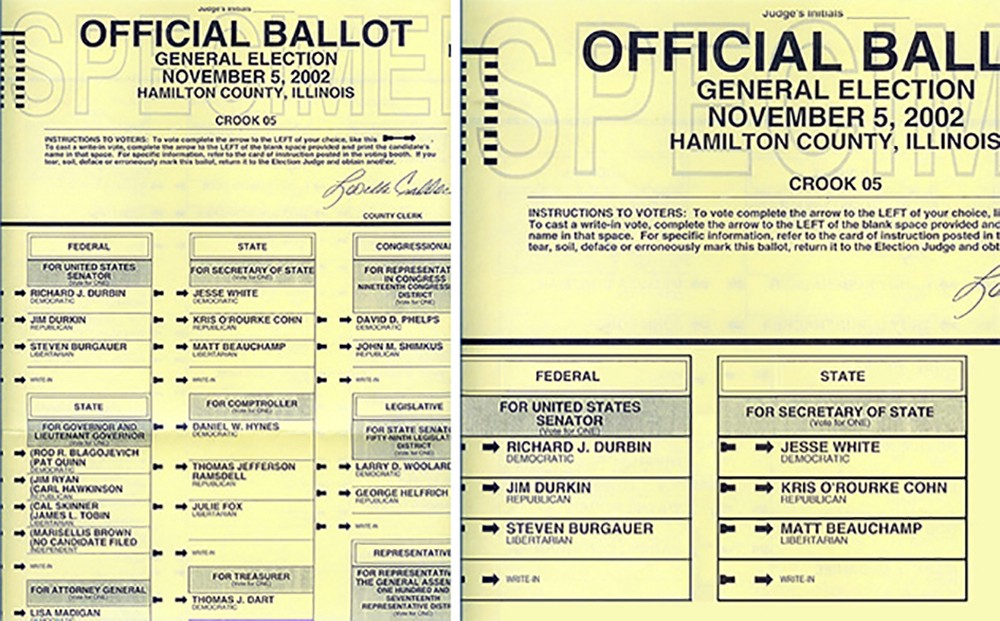
In the 2002 mid-term election in Illinois’ Hamilton County, each column of candidate names was next to a series of incomplete arrows. Voters were supposed to indicate their choice of candidate by completing the arrow on the left of the candidate name. But because we read left to right and the candidate names in two races lined up perfectly, many voters marked the arrow to the right. As presented in a Brennan Center analysis, setting the columns a bit further apart and adding borders would have cleared up this confusion:
In Minnesota in 2008, Al Franken beat Norm Coleman for the U.S. Senate seat by a sliver, less than 300 votes. In that race, almost 4,000 absentee ballots were not counted because the envelope was not signed. The Minnesota Secretary of State’s office decided to redesign the mailing envelope. After a series of usability tests, they added a big X to mark where people should sign. In the following election in 2010, the rate of missing signatures dropped to 837. Below is the before and after from a Brennan Center report:
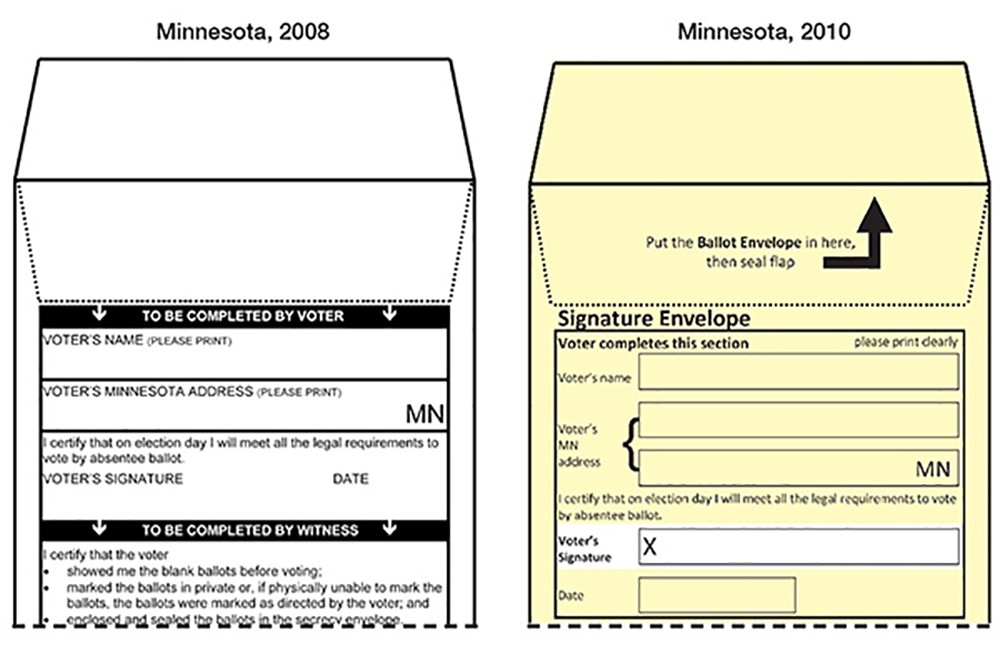
Minnesota’s mailing envelope is a good example of how designers can solve design problems well before any election actually happens — by testing those ballots beforehand.
“Test and test and test,” recommends Don Norman, a designer and cognitive scientist who wrote the the book on designing objects for everyday life. The most important aspect of ballot design, he says, is considering the needs of the voters. He suggests doing extensive testing of ballots on a sample of people, which should include those who are “blind, deaf, or people with physical disabilities as well as people with language difficulties.”
Bad Instructions Are a Design Problem Too
Beyond layout and ordering, the unanimous winner for worst part of ballot design? Instructions.
“The instructions are uniformly horrible!” said usability expert Dana Chisnell, who co-directs the Center for Civic Design with Quesenbery. Confusing jargon, run-on sentences, old-fashioned language left over from 100 years ago: all of these plague ballots across the country. Here are a few example instructions (the first from Kansas, the second from Ohio) along with the Brennan Center’s redesign:
Before

After

Before

After

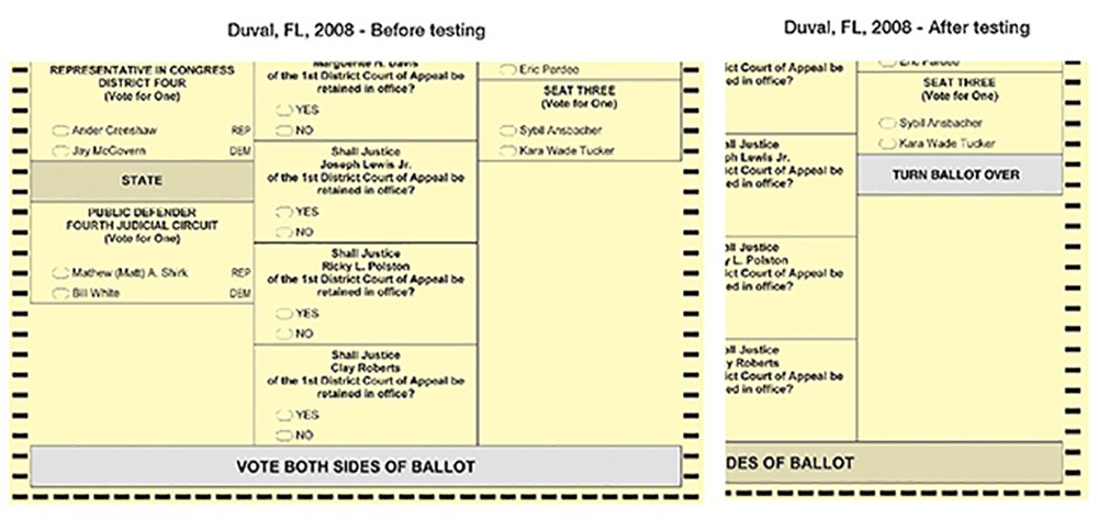
Even if the instructions are clear, placement of instructions has a huge effect on whether people understand them. In usability tests conducted in Florida’s Sarasota and Duval counties in 2008, the majority of participants got to the end of the ballot and stopped. Which was a problem, because the ballot continued on the other side. Despite instructions specifically telling people to vote both sides of the ballot, they didn’t.
So designers added three words to the end of the right column: Turn Ballot Over. The result? An estimated 28,000 fewer lost votes in the two counties that adopted the redesign. Here’s the before and after:
Designers Have Already Put Together Guidelines for Making Better Ballots
Luckily, there are resources for how to help avoid these predictable problems. In addition to Lausen’s book, the Design for Democracy initiative has worked for years at applying design principles to improve elections. A few years ago the design association AIGA combined forces with Whitney Quesenbery and Dana Chisnell to condense their best practices into a set of handy field guides.
The ballot-specific guide, Designing Usable Ballots, has this advice:
- Use lowercase letters.
- Avoid centered type.
- Use big enough type.
- Pick one sans-serif font.
- Support process and navigation.
- Use clear, simple language.
- Use accurate instructional illustrations.
- Use informational icons (only).
- Use contrast and color to support meaning.
- Show what’s most important.
For the designers, these recommendations may seem obvious. But election officials — the ones responsible for laying out a ballot — are not designers.
Sometimes, Reality Thwarts Good Design
Even if officials wanted to follow every design best practice, they probably wouldn’t be able to.
That’s because ballots are as complicated as the elections they represent. Elections in the U.S. are determined at the local level, and so each ballot must be uniquely crafted to its own jurisdiction. Ballots must combine federal, state, and local contests, display measures and propositions, and sometime require voters to express their choices in various formats — for example ranking their choices versus selecting one candidate for the job.
“There will always be special circumstances that present new problems for ballot design,” said David Kimball, a political science professor at the University of Missouri–St. Louis who has written extensively on voting behavior and ballot design.
Take what happened this summer in California’s Senate race primary. A record number of 34 candidates were running to replace incumbent Democrat Barbara Boxer, and the ballot needed to fit them all. In many counties, elections officials simply couldn’t follow the good design recommendation of “Put all candidate names in one column.”
To Make Matters Worse, Bad Design Is Written Right Into the Law
Election officials are often constricted in what they can and can’t do by specific language in their local election code. More often than not, the law is to blame for bad design.
For example, numerous jurisdictions require that candidate names and titles be written in capital letters. This goes against huge amounts of evidence that lowercase letters are easier to read. Other requirements like setting a specific font size, making sections bold, or center-aligning headers make it next to impossible to follow all the design best practices.

Some election code requirements just seem to invite clutter. In Kansas, a candidate’s hometown must be listed under their name. In California, the candidate’s occupation. Designers argue that this additional text complicates the ballot with needless information, but they can’t get rid of it without breaking the law.
“It’s amazing how many design prescriptions are written into law by non-designers,” said designer Drew Davies, who has worked with numerous jurisdictions to improve their ballots and voting materials and is design director of AIGA’s Design for Democracy.
Some of those prescriptions border on the comical. In New York, election law requires that each candidate name must be preceded by “the image of a closed fist with index finger extended pointing to the party or independent row.” Here’s how that actually looks on real New York ballots:

In Design, Everything Matters — Even the Order of the Candidate Names
Some design problems are not as obvious as a pointing finger. Take something as simple as the order of the candidates’ names. There is a well-known advantage for being listed first on the ballot. The “primacy effect” can significantly sway elections, especially in smaller races not widely covered in the media where there is no incumbent. One study of the 1998 Democratic primary in New York found that, in seven races, the advantage from being listed first was bigger than the margin of victory. In other words, if the runner-up candidates in those races had been listed first on the ballot, they likely would have won.
As one report puts it, “a non-negligible portion of local governmental policies are likely being set by individuals elected only because of their ballot position.” To combat this unconscious bias, some states have already mandated that names are randomly ordered on the ballot. Still, many states and jurisdictions do not have a standard system for organizing these names.
The Future Will Bring New Design Challenges … but Also New Ways to Make Voting More Accessible
As more and more states adopt absentee andvote-by-mail systems, they make voting more accessible and convenient — but they also introduce new ways of making mistakes. And those errors are only caught after the ballot has been mailed in, too late to change. A polling place acts as a fail-safe, giving you the opportunity to ask a poll worker for help or letting you fill out a new ballot if yours gets rejected by the voting machine. But on an absentee ballot, if you made a mistake and your vote isn’t counted, you’ll never know.
There are several current efforts to overhaul the ballot entirely. Los Angeles County, for example, has teamed up with the design company IDEO to create an easier and more accessible way to vote. Their customizable device would let people fill out a sample ballot on their own time from a computer or mobile device, and then scan a code at the polling place to automatically transfer their choices to a real ballot.
The Anywhere Ballot is another open-source project that’s designed to create a better voting experience for everyone — including voters with low literacy or mild cognitive issues. Their digital ballot template, which came out of extensive user testing and follows all the current ballot design best practices, lets anyone use their own electronic device to mark a ballot.
But, of course, the design problems that plague ballots affect all aspects of the voting process.
Voter registration materials, mailed voter guides and education booklets, election department websites and online instructions, poll worker materials — all of these have problems that can be improved with better design.
“Ballots are where all the drama happens,” said designer Lausen, “but there is much more to election design.”
This story originally appeared on ProPublica as “Disenfranchised by Bad Design” and is re-published here under a Creative Commons license.


