On the evening of August 18, 2011, viewers of The Daily Show were treated to a droll but distressing lesson in statistics. “The United States is not a Third World country by any measure,” Jon Stewart told his audience, “except, perhaps, income inequality.” To Stewart’s left, a ranked list of countries flashed on the screen, topped by Sweden. Then, in a blur, the list scrolled down to its middle-bottom reaches. “We rank worse than the Ivory Coast, worse than Cameroon: 64th!”
After a few moments trash-talking the nations just below us on the list (“In your face, Uruguay, Jamaica, and Uganda! … Keep trying, Rwanda!”), Stewart pulled away from his desk, covered his mouth, and uttered a disconsolate “Wow.”
What the graphic next to Stewart showed was an obscure statistical list called the Gini Index, which is used by the CIA and the World Bank as a standard gauge of family-income inequality in a country. The index gives each of the world’s countries a score somewhere between zero (perfect equality) and 100 (the most unequal).
The Gini renders what everyone has been talking about for the past couple of years—inequality—in terms of a single, elegant number. In 1979, the top 1 percent of Americans took home almost 10 percent of the nation’s income; today the top households get 20 percent of the nation’s paycheck. That change, which became a heated part of the presidential election, boosted the U.S. Gini by at least six points, to 45. The increase landed us in uncomfortable company, as Stewart pointed out on The Daily Show. But the only thing more bizarre than America’s income inequality exceeding Cameroon’s is the fact that the hoary old Gini Index—previously embraced only by spooks and wonks—had become a punchline on late-night TV.
The Gini Coefficient, which can measure inequality in any set of numbers, has been in use for a century, but until recently it rarely left the halls of academia. Its one-number simplicity endeared it to political scientists and economists; its usual subject—economic inequality—made it popular with sociologists and policy makers. The Gini Coefficient has been the sort of workhorse metric that college freshmen learn about in survey courses and some PhD statisticians devote a lifetime to.
Corrado Gini
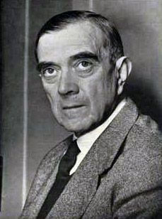
It’s been so useful, so adaptable, that its strange history has survived only as a footnote: the coefficient was developed in 1912 by Corrado Gini, an Italian sociologist and statistician—who also wrote a paper called “The Scientific Basis of Fascism.” After running Italy’s Central Institute of Statistics under Mussolini, Gini eventually had a falling-out with the fascist state, but he remained a control freak to the end of his life. In the 1950s, at his own statistics institute in Rome, he made his professors and assistants work “in small glass boxes, fitted with a microphone which Gini could use to listen and talk, but the occupier of the box could only reply if spoken to,” according to a professor who worked there. To Gini, statistics—including his famous coefficient—were a way for states to see beyond the “noise” of individual feelings and agendas, channeling human and material resources to become more powerful.
And yet, nearing its 100th birthday, the Gini Index became part of the noise in the streets. When crowds at Occupy Wall Street events shouted “We are the 99 percent,” the media reached for the Gini to explain and evaluate the broad narrative of inequality. Not to be left out, the 1 percent—specifically, the ultrarich at this year’s annual do in Davos, Switzerland—voted “Severe Income Disparity” as the top probable global risk for the next 10 years. Through it all, the Gini Index has been both the measurement and the messenger, offering a simple way to talk (or joke) about a complex subject.
It’s been a strange journey for this versatile metric, which was conceived as a way to create statistical correspondence between newly rich urban Italian industrialists and the illiterate peasants who were isolated in the countryside, beyond the reach of roads or radios. Now we are all enmeshed in electronic correspondences—the Internet, Twitter, comedy shows reporting the news—that cover the globe, reflecting and refracting us into a state of hyper-awareness. Sure, the Gini Index lets us compare ourselves to far-off Africa, but what does that mean anymore?
THE GINI COEFFICIENT is no Zagat guide for tourists, because although the metric looks simple, inequality is a complicated subject. I discovered this when, in 2012, I visited Namibia, the country with a Gini score of 70.7, the world’s highest.
I had already been to the country with the lowest Gini number—Sweden, 23. I was impressed by the tidy streets, the picturesque town squares, the contentment of the citizens out on a Sunday-afternoon walk. All were in similarly spiffy stonewashed jeans (it was 2002) and looking naturally healthy and optimistic. There seemed to be little crime, and certainly no homelessness. But Sweden was no bland socialist paradise: with the base of Maslow’s needs pyramid covered, including health care, education, and breakfasts of rye crackers and fish paste, the Swedes were free to purchase tea lights, booze, and quirky shoes. I was there to write about that infectiously middle-class purveyor of pragmatic furnishings, ikea. The Swedes took consumerism to a new level: I learned, from the windows of the small shops in town, that expensive chainsaws were considered sporting goods. I concluded that equality was working as well for Sweden as it was for ikea.
When I saw Namibia’s soaring Gini score of 70.7, I expected the country to be Sweden’s opposite: chaotic, noisy, unsafe, full of beggars. I had, after all, been to Nigeria, where the Gini score was 42, and found it a mad jumble of rich and poor, fighting over a sinking infrastructure; wealthy people’s houses were surrounded by walls and guys with AK-47s. One morning I looked up a 20-foot-high garbage pile and saw a man in a suit, carrying a briefcase, cresting the heap and descending to the street where urchins played with the debris. Safety, both physical and psychic, is in short supply in Nigeria. Sitting at a nice restaurant, one is always aware that the shadows conceal armed guards, ready to defend your privilege to drink a quiet cup of tea. A simple trip across town is impossible by bus, and taxis are likely to be caught in traffic, so I climbed on the back of a motorcycle driven by a daredevil member of the middle class, and went blasting through crowds and puddles of unknown depth. There is a pervasive sense that getting anywhere means (literally) pushing someone else down. The haves and the have-nots are engaged in a daily, circular struggle, like in those old cartoons of Andy Capp and his wife.
Countries of the world shaded by their Gini index number. Click on a country for its actual score. (Data derived from CIA World Factbook. Where unshaded, no data was available.)
So I was surprised when Namibia, with its much higher Gini rating, seemed more like Sweden. I picked up a rental car at the airport. As I was leaving, four middle-aged women in blue Air Namibia uniforms flagged me down and asked for a ride into the capital. They piled into my VW Polo and off we went, giggling, as they checked their Facebook pages from their phones. They warned me against picking up strangers, but the fact that they had flagged down my car suggested a basic level of safety and civility. The roads are well maintained and orderly, with modest numbers of older VWs and BMWs moving about. I didn’t see any homeless people, nor anyone that seemed particularly rich; certainly no men with guns. Markets were low-key. A visit to the local police station after a friend was in a fender bender was cordial, if time-consuming, and revealed a dedication to the rule of law that seemed right out of a BBC sitcom. The only time I saw traffic stopped was when the road was clogged with protected zebras. I could see why Brad and Angelina came to Namibia to give birth.
Namibia is rich in uranium and diamonds, and the ruling party describes itself as socialist. I asked a government official what accounted for the high Gini number. He said he often wondered the same. He offered that neighboring Angola, with all its oil money and its poverty, must surely be worse. “Every time you see something like a Ferrari on the streets here [in Namibia], it’s always registered in Angola,” he said. But Angola’s Gini score is around 59—not too different from Brazil’s.
In Namibia, the Gini number hints at something the casual visitor cannot see: 10 percent of the country’s 1.9 million people take in 60 percent of the country’s income. In effect, that 10 percent owns the Namibia I visited: a tiny, tidy, middle-class country within a country, not prone to ostentatious display. But Namibia has another, larger population of subsistence farmers who may not be starving, but who have very little cash. About a third of the country lives on less than $1 a day, according to a 2007 government report (pdf), and nearly one in five people has AIDS. Namibia doesn’t exhibit the extremes of Angola (which has super-wealthy and super-poor people and a large population somewhere in the middle), but Namibia, with its legacy of apartheid, might as well be two separate countries, one middle-class and one poor, sharing the same land. A look behind the Gini number reveals that Namibia lacks Nigeria’s frightening, feverish dynamism, and extends its Sweden-ish security to only a few.
TIMOTHY SMEEDING, the director of the Institute for Research on Poverty at the University of Wisconsin at Madison, and the editor of The Oxford Handbook of Income Inequality, explains that the Gini Index doesn’t really offer much information on poverty. The Gini, he says, is more like a gateway drug, “something that expands interest in the idea of measurement of inequality.” From there, budding bureaucrats go on to more-nuanced instruments: the Atkinson Index, the Theil, the Sen, and a host of Gini Indexes juiced with specialized variables.
Smeeding sent me an Excel spreadsheet with measurements that dig deeper. One included the wonky-sounding P90/P10 decile ratios. Such a ratio, by comparing the income of people in the top 10 percent to the income of people in the bottom 10 percent, reveals things that the Gini does not. For example, the CIA now lists the United States and Uruguay as having similar Gini scores. But Smeeding’s data from 2004 shows that while the poor in both countries get a similar share of the median income, the super-rich of Uruguay get a much higher percentage of the remainder than do their counterparts in the U.S.
“Poli-sci people love [the Gini Index] because it’s just one number per country,” Smeeding says, but for real nuance, they need more numbers.
When we look at inequality through the prism of more precise measurements, we can start to talk about what inequality really is: a condition with a great many variables, moving parts, and implications. The Gini Index removes that complexity from the discussion (as you can see in Namibia)—but it does let the discussion begin. Can you imagine Jon Stewart riffing on P90/P10 decile ratios?
CORRADO GINI WOULD HAVE BEEN FURIOUS to see his coefficient bandied about on The Daily Show. The last thing he wanted to do was create a measurement that made it easy to make snarky moral judgments about inequality.
Gini was a brilliant statistician—he authored perhaps 800 publications in his career, and he saw himself locked in a mortal battle to establish statistics as a hard, predictive science like physics. He was up against the British school of social science, which took a more Dickensian view that inequality was a problem to be solved. Gini didn’t want to start a social movement, he just wanted to make an impartial instrument—like a thermometer or an altimeter—that he could drop into any country, at any time, to get a quick read on inequality.
When Gini sat down in 1912 to write his coefficient, he was a 28-year-old nationalist who believed a country derived its strength partly from the size of its population. And Italy, by this analysis, was in trouble. The cities and the northern parts of the nation were relatively prosperous and educated, but in the rural south, 70 percent of the population was illiterate, and poverty was endemic. In the previous fifteen years, nearly ten million Italians had left Italy looking for a better life.
When Gini looked up from his desk, he could see a crisis of depopulation through immigration, driven by inequality, but when he looked down at his calculations, that inequality appeared irrelevant according to the dominant metrics of the time. Italians back then measured income inequality crudely, with the Pareto Curve, a power-law probability graph that consistently showed that 20 percent of a population controlled 80 percent of the wealth—regardless of time, people, or country. According to Pareto, inequality was a sort of natural social law; democracy—or indeed any government aiming to do any more than control the people, who were starving—was a ridiculous waste of time, because the poor would always be dissatisfied.
“Gini was a bit doubtful of this,” says Jean-Guy Prévost, a historian of statistics at the University of Quebec at Montreal. “He had examined Pareto’s statistics and thought they were sparse.”
Gini created his coefficient—really a ratio—by superimposing a “map,” or graph, of real inequality over a graph of perfect equality. In a sense he was comparing two countries: one real, one an income-equality utopia.
First, Gini mapped the real incomes by lining them up from smallest to largest, and entering them on a graph to plot what is called the Lorenz Curve—an arc from zero to 100.
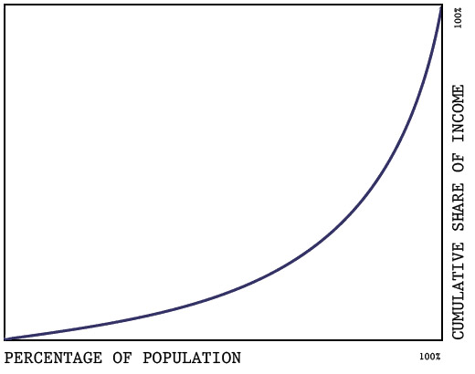
In the same graph, he mapped a solid triangle where income was distributed equally.
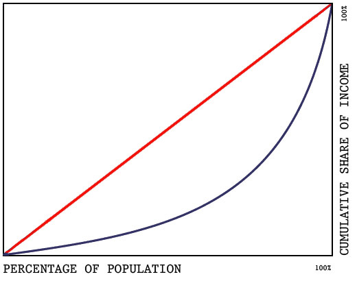
Then he divided the area formed by the Lorenz curve:
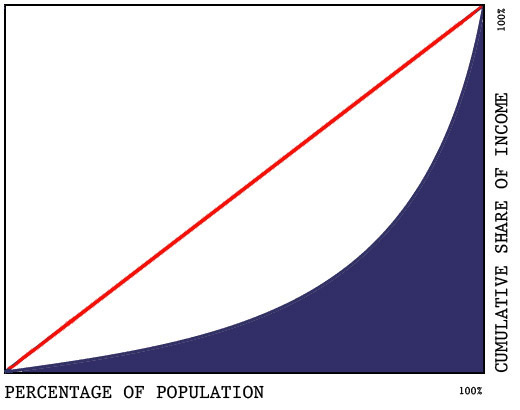
… by the area of the equality triangle:

… to get the Gini Coefficient.
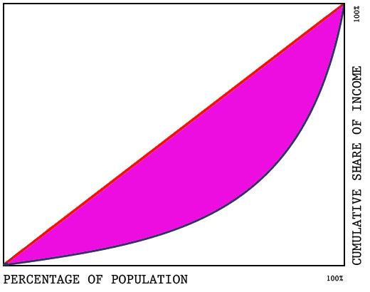
If a society has a relatively equal distribution of income, like Sweden’s, the area defined by its Lorenz Curve will take up more of the utopic, or ideal, triangle, creating a lower Gini Coefficient. For a society like Namibia’s, that area will be smaller, yielding a higher Gini ratio.
After 100 years—and a revolution in computing power—the Gini methodology still works because it is based on the two maps, indicating complexity in a simple way.
Gini was personally and professionally ambitious: he saw statistics as a means to run a modern, homogeneous, consolidated state, not the old kind of country run on values, hereditary aristocracy, or religion. To this end, he set about creating a sort of factory of facts during World War I, ordering surveys of smuggling, suicides, and sanitation. After the war, he used his statistical acumen to wrangle more calories for Italians when the British proposed that because Italians were of shorter stature, and lived in a warmer climate, they should get smaller rations than the British and French. Gini, who had once written a paper called “L’uomo Medio,” or “The Average Man,” argued that Italians were short because they’d had a debilitating diet for centuries, decimated some of the other generalizations in the British proposal, and won the day. As head of Italy’s Central Institute of Statistics in the 1920s, he answered daily requests for fresh stats from Mussolini himself. In a famous speech in 1927, Mussolini aligned statistics and the state:
I shall have to include many facts and figures, not because I share the opinion of those who claim that numbers rule people—No! Numbers do not rule people—but in a large and complex modern society, numbers are a necessary tool for the serious governance of a nation.
Gini infamously wrote his laudatory essay “The Scientific Basis of Fascism” in 1927, before breaking with Mussolini in 1932. Today, fascism is long dead and many of Gini’s ideas are thoroughly discredited, but the role of statistics, sampling, and counting is so deeply embedded in our culture that it’s hard to remember when we were not counted. During election season, every morning’s news carries polls, reflecting our countedness back at us. Surveys constantly ask us to “stand up and be counted,” as if consenting to be averaged is necessary for self-esteem. The very slogan “We are the 99 percent” means we have internalized—No! Embraced—the kind of statistics-driven world Gini envisioned.
GINI SUCCEEDED IN CREATING THE GLOBAL STANDARD OF INEQUALITY MEASUREMENT, but he failed to steer us away from moral judgments about his numbers. Hardly anyone looks at a Gini score today without judging it as good or bad.
Take Namibia: “Ahh. Namibia has a bad rap,” says Branko Milanovic, a lead economist in the World Bank research group and the author of The Haves and the Have-Nots: A Brief and Idiosyncratic History of Global Inequality. “The Namibians write to me and ask why we always mention them as the worst.” He points out that the “goodness” of a Gini number is based entirely on a gut moral judgment, unanchored in context, that lower is better. Brazil’s Gini number has fallen below 60, but it’s still really high. Milanovic, whose estimates of Gini inequality are slightly different from the CIA’s estimates, says, “Now we say that Brazil is 55 and good; and the U.S. is … bad [because the number has risen to 45]; and Poland was 25 [under Communism] and everyone who lived there knew that was no good! These three judgments are very contextual,” Milanovic exclaims.
The Gini Index has often been understood to offer not only a diagnosis of inequality, but a simple prescription: lower your score by raising taxes on the rich and redistributing money to the poor. In short: be more like Sweden. In the 1970s, the British government gave poor families £6 a week. In 1979, U.S. tax policies and transfer programs reduced our Gini number from 48 to 37. By definition, being a modern, compassionate state has meant doing something to directly reduce inequality. Tax adjustments have been an easier strategy for governments; addressing deeper causes of inequality—like disparities in education, land rights, or labor policies—is slower, more difficult, and riskier.
When I asked Peter Lambert, a professor at the University of Oregon and the author of several books on the Gini Coefficient and income distribution, why the Gini methodology is still relevant today, he listed the usual reasons, but one point surprised me. The index, he said, “allows people to care about each other, which is quite unusual in welfare theory”: It instills empathy, solidarity, and even political consciousness.
Since 2000, China’s leaders have refused to release their country’s Gini score, claiming that they could not reconcile the different methods used to calculate rural and urban incomes. Experts suspect that the government doesn’t want to admit that its collective Gini score—as low as 29.9, in 1987—has become higher than those of many non-Communist countries. When Bo Xilai, the now-disgraced former Chongching politburo chief, revealed the country’s “real” Gini number of 46 at a press conference last March, he stressed that Gini ratios above 40 are precursors of social unrest and instability. In a country that dealt with 180,000 “mass incidents” (read: riots) in 2010, it was not clear whether Bo was merely exploring the hypothetical relationship between high inequality and unrest, or actively provoking unrest by announcing the true number—like someone throwing a Molotov cocktail into a crowd. (The press picked up on the dissonance in Bo’s speech and asked whether it was true that his son drove a red Ferrari.) After a strange series of events, Bo was detained and charged with corruption and other crimes.
As if to further confound its creator, the Gini Coefficient has joined the modern Twitter culture, morphing into a tool of self-awareness and action. During the Arab Spring, unrest in Egypt and Tunisia was carelessly chalked up to a reaction to increased inequality.
Branko Milanovic says that notion is simply not true: in both countries, inequality measurements had been relatively static—at 33 to 36—for 20 years. What changed, says Milanovic, was the awareness of inequality, an awareness spurred by a culture of conspicuous consumption among the rich, and then absorbed, tweeted, and retweeted by the masses. Milanovic cites three decades of results from the nonprofit World Values Survey that show that the global public is increasingly aware of inequality—so much so that the sense of inequality is rising even faster than are the indicators of income inequality. Gini tried to represent his peasants and industrialists with a single number, but in Egypt and Tunisia, it was social media that connected people, built their awareness of inequality, and enabled them to revolt against an unfair system.
In the United States, academics had been watching inequality rise for years and “tearing their hair out” over how to get the public’s attention, according to David Grusky, the director of the Stanford Center on Poverty and Inequality. But suddenly, the Occupy Movement brought the gap between “the 99 percent” and “the 1 percent” into the national narrative, and talk of inequality took off. Almost overnight, inequality “felt true” to a large number of people. “Democrats used to fear charges of class warfare. Obama [thought] he could win with inequality,” Grusky said. “That’s both cause and effect.”
WHEN GINI FIRST MAPPED INCOMES ONTO CHARTS, his nation’s fat cats made things like shoes and ships, not financial derivatives and media empires. To paraphrase Branko Milanovic, Gini was trying to map the inequality created in the “big bang” of the Industrial Revolution. But we are now in the midst of a new “bang,” one caused by globalization, the rise of India and China, and the information economy. To understand inequality’s new trajectory, we need to read the old Gini numbers differently. We might long for the old models and remedies—Sweden, anyone?—but in this new unequal world, the disparities run deeper.
In the United States between 1979 and 2007, the Gini Coefficient for pretax income, according to a study by the Congressional Budget Office (pdf), rose from 48 to 59. Service-industry jobs at the low end pay less now than in 1979, and high-skilled jobs on the high end pay much more—CEO compensation, in particular, has climbed into the stratosphere. Income from business, investment, and capital gains has also shifted toward the rich. While the U.S. debate around rising inequality has focused mostly on whether to tax the rich more, the rising pretax inequality suggests that part of the problem lies at a more basic level: our economic plumbing has changed, carrying more money now to people already higher in the income brackets.
As the second “bang” reverberates around the globe, a funny thing is happening to those nation-states Gini was so keen to strengthen. Rising inequality in the U.S. is part of a global phenomenon: in China, across Europe—even in Sweden—the Gini number has been climbing, as the redistribution of money takes place within, around, and over national borders. As the newest big bang continues, rising inequality will challenge the stability and existence of those nation-states.
“We are at a turning point, and there’s no guarantee of what will happen,” says Milanovic. “Right now, we’re focused on how one country is more unequal than another, but … in 50 years there could be a global upper class—a plutocracy.” Looking into his databases, Milanovic sees that maybe Namibia, with its Gini score of 70.7, is not such an outlier. The Gini number for the planet as a whole is around 70, with the 11 percent of the world’s people who are rich jetting about, and the 13 percent who are middle-class shopping at ikea. That means that the 76 percent who are poor are left at home, feeling acutely that their governments have let them down.
Talking with Milanovic, I realize with a shock that I (and you) are already living in a global version of Namibia: our income levels unite us with a small fraction of people across the world, and divide us from the people across town. The “average man” has become more aware and more enabled, while the average nation-state has lost some of its meaning and power.
None other than today’s global plutocrats—those Davos billionaires—have already cottoned on to the dangers of the rise in inequality. In January, Bloomberg reporters interviewed some of the 70 billionaires at Davos who said that income disparities would hamper global economic growth, create social and political instability, and invite chaotic upheaval of the Arab Spring sort. In a separate poll of 1,209 international investors, half said that income inequality would hamper growth. One in three backed radical (but unspecified) changes to the capitalist system. The old days, when a high Gini ratio prompted a change in tax structure, are long gone. Now both the rich and the poor are casting about for more-sweeping solutions. We find ourselves at one of those dangerous times when the world is changing faster than anyone understands and the losers outnumber the winners—a time not unlike the moment when Gini sat down to work out his coefficient.
How will we find a new way to connect the haves and the have-nots? The answer, I think, lies not so much in the Gini score’s simplicity, but in the number’s ability to inspire awareness and empathy. While researching this story, I read about a collection of biological studies (pdf), done by Gary W. Evans, Jeanne Brooks-Gunn, and Pamela Kato Klebanov, that found that poor children, compared with middle-class children, have much higher levels of stress hormones, and higher blood pressure. By their late teens, poor children’s stress takes a toll on some important brain functions, limiting the kids’ ability to do well in school and to later earn good wages.
The study, which was published in the Stanford Center on Poverty and Inequality’s magazine, Pathways, has a practical conclusion: Head Start and other pre-school education programs are a great social investment, and we need more of them. But I found myself fretting about those stressed-out grade-schoolers, multiplied across the globe. To put it in terms a plutocrat might appreciate: inequality is a waste of human capital. Only with a tremendous amount of conviction can we reset the trend in inequality to a more productive, more humane level. But one thing that could motivate us is empathy for that “average man.” Or the average kid. ★


