A tweet from writer Daniel Kay Hertz recently set Fair Housing Twitter astir.
It linked to a 2015 blog post written by Cleveland real estate broker James Wise titled “The Ultimate Guide to Grading Cleveland Neighborhoods.”
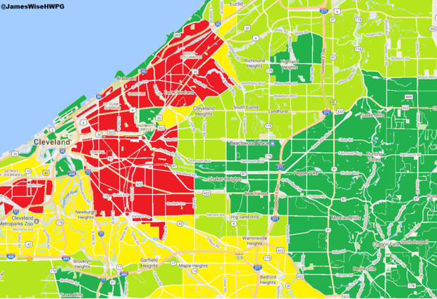
The blog, posted on the real estate investment platform BiggerPockets, shows how Wise grades real estate for investors, grouping Cleveland’s neighborhoods into four color-coded categories: “A Neighborhoods,” shaded dark green; “B Neighborhoods,” shaded light green; “C Neighborhoods,” shaded yellow; and “D/F Neighborhoods,” shaded red.
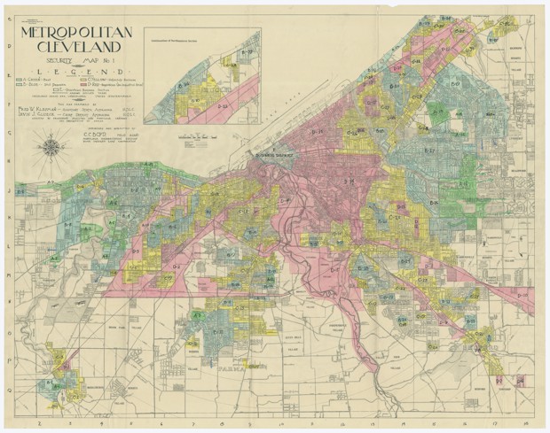
https://twitter.com/DanielKayHertz/status/1055241391423533057Wise’s maps ring eerily similar to redlining maps, the color-grading system used by the Home Owners Loan Corporation (HOLC), the National Association of Real Estate Boards, and the Federal Housing Administration (FHA) in the early-to-mid 20 century to demarcate which neighborhoods were worthy of property investment. Redlining was technically outlawed by the 1968 Fair Housing Act because it facilitated racial and economic segregation in many United States cities, segregation that persists.
Wise bills himself as “the number one seller of Multifamily & Commercial properties in the greater Cleveland, Ohio, area,” in his BiggerPockets bio. When stacking his neighborhood-grading maps against the 1936 HOLC map of Cleveland, one can see that the color-coding schemes have few differences, a testament to how little spatial residential dimensions have changed in Cleveland.


For the HOLC maps of the 1930s, the color-coding was about neighborhood desirability as an indicator for not only whether one should invest there, but also for whether a bank should even give a loan to purchase homes there. Desirability was defined by the neighborhood’s household incomes, the percentage of homeowners, and by “homogeneity”—whether white people made up the majority of the neighborhood.
In the HOLC neighborhood profiles, the first metric identifies what percentage is “foreign families” and “negroes” and what level of “shifting or infiltration” of non-white populations is on the verge.
Wise’s map does not come with neighborhood profiles, but every neighborhood listed in the dark green “A” category has at least a 75 percent white population (except for one, Shaker Heights, which has a 52 percent white population). All are located outside of the city of Cleveland, and most boast median incomes upwards of $75,000. Of the five neighborhoods with median incomes below $75,000, all have at least 80 percent white populations, except for University Heights, which has a 71 percent white population.
The red “F” category is called the “Warzone” in Wise’s blog, and consists of the African-American East Cleveland neighborhood and several zip codes that have majority black populations, and most of which have incomes below $22,000. The D category, also red, consists of just three neighborhoods, each of which have sizable black and Latino populations, all located in the city and with majority renter populations. Wise notes that one of these zip codes, 44109, is split between “the good part,” which is south of highway 71 and the other part north of the highway where the median income is below $30,000.
Cleveland is infamously bifurcated by race between its east and west sides, the former being where most of the black population lives and the latter where most of the white population lives. All of the D and F neighborhoods are located on the east side.
And while this blog post was created in 2015, a commenter created a new map in 2017 that showed essentially the same grading, though they didn’t bother placing the D and F neighborhoods on the map. As Wise replied to one of his 90 commenters: “The map as you see it today is pretty much in the same shape as when I originally wrote the blog.”
The blog’s comments are arguably as problematic as the maps. BiggerPockets is a platform used almost exclusively for those in the real estate trade, so these are the people responding to the post. When the commenters are not giving Wise praise—”You’re a saint, thank you for posting James!” wrote one—they are thanking him for guiding them in their next investments:
This is an awesome post and love the fact that you color coded all the areas so that out of state investors, like myself, can see what areas should not be considered.
Great resource James! Thanks so much. My associate & I invest in multifamily buildings, 4-plex up to 100+ units for long-term cash flow. What area in the Cleveland area would you recommend for these types of investments? Of course we want to avoid the high risk/crime areas, but wish to maintain high occupancy.
Hi @James Wise this is a fantastic if map and many thanks for putting it together. I have printed it and use it as a quick visual resource during due diligence on any property in Cleveland. I wish there was a map like this for all US cities! Well done and thanks for giving back.”
There are also commenters who requested similar redlining maps for other cities, and in at least one case that wish was granted. The BiggerPockets website also has an “Investor’s Guide to Grading Indianapolis Neighborhoods” that looks similar.
Asked if BiggerPockets monitored for possible discriminatory activity on its blog, the website released this statement:
This is the first time that BiggerPockets has been contacted by a third party about the post you refer to (which is user-generated content, similar to a post on medium.com, a tweet, or a post to a facebook account, and thus not reviewed by BiggerPockets staff prior to the user posting it to their personal member blog on BiggerPockets), and we are not aware of staff involvement in the publication or sharing of this post.
BiggerPockets is not in a position to assess whether this post is unlawful or illegal. The opinions and content belong to the user who posted them, and you are free to respond to the post or reach out to that person.
Wise told CityLab that he “adamantly disagrees” that his maps have anything to do with race or skin color.
“This is an educational document created based solely upon risk factors determined by income, criminal activity, and property damage,” Wise said. “The audience for this particular document is real estate investors buying investment properties for monetary gain. These are not people living in these neighborhoods. These are people who are simply looking to obtain a return on investment. I have no comment on the racial make-up of these neighborhoods.”
Sally Martin, housing director for the city of South Euclid, a suburban municipality outside of Cleveland where Holton-Wise has several properties, said the city took the real estate company to court earlier this year because it failed to register its rental units, which is required by law so that the city can track services such as inspections. Other fair housing advocates in Cleveland who spoke with CityLab said that Wise’s online activities aren’t necessarily illegal, but don’t align with the spirit behind fair housing policies.
“Anyone who has an understanding of the history of redlining and the tremendous impacts that still resonate today would naturally recoil at seeing a map published like that,” said Jeffrey T. Verespej, executive director of the Old Brooklyn Community Development Corp, “due to the mere spitting mirrored image of those illegal and racist housing policies from generations ago being repeated today. The sins of redlining from the past have not yet been repaid and our communities are still being negatively attributed and therefore resource depleted based off of those historical maps.”
Some housing advocates in Cleveland tried to find a silver lining, as it were, in Wise’s redlining maps.
“On one hand you can argue that he is advising real estate investors to not invest in those neighborhoods,” said Michael Lepley, senior research associate for the Fair Housing Center for Rights & Research in Cleveland. “But on the other hand, if he’s engaged in some questionable practices, and if the people he’s giving advice to are engaged in questionable practices too, then you can look at it as maybe he’s convincing bad landlords not to do business in neighborhoods where they might otherwise prey on the most vulnerable.”
In other words, Wise might be doing fair housing advocates a favor by steering away exploitative speculators. According to Lepley, Cleveland was one of the hardest cities hit by the mortgage crisis, which means the city has a lot of foreclosed properties that can be snapped up by foreign investors for cheap, then flipped in ways that end up making them suddenly unaffordable to low-income and working-class residents.
Another problem, according to Frank Ford, senior policy adviser for the Western Reserve Land Conservancy, is that some investors buy cheap, foreclosed properties at low prices, and then do minimal, sometimes below-code renovations on properties before putting them back on the market for resale or for rent. For years, Cleveland did not have strong enough code enforcement inspectors to catch investors doing this, said Ford, though he said this has improved in recent years. But he also thinks that Wise might be inadvertently keeping the vultures away.
“The idea of an investor saying ‘I will stay away from buying property in the most distressed markets’ is a 180-degree flip from what most investors have been doing coming into Cleveland,” Ford said. “Some of us would probably welcome that.”
It’s not clear that this is what Wise is engaging in, though. A recent marketing email from Wise’s company states in the subject line, “We’ve monopolized an entire neighborhood. Do you want in?” It advertises a 15-unit apartment building in Brooklyn, Ohio, a small municipality just outside of Cleveland’s borders that Wise grades as a “C” neighborhood, where owners can expect tenants who are “Blue collar workers, low income workers, retail, service industry workers, factory workers,” and where rents are modest. Wise’s email ad says that the rents in the apartment building currently total $7,817 a month but that “rent can easily be increased to $9,165/mo.”
This property is about two-and-a-half miles away from the Old Brooklyn CDC where Verespej says they’ve been trying to prevent real estate market exploitation from foreign investors with no connection or accountability to the neighborhood. He says he welcomes investment, but is less convinced that Wise’s maps might have any kind of prophylactic effect against shady real estate investors.
“The lack of investment and the blight is a greater challenge to quality of life and to stability,” Verespej said. “I certainly appreciate looking at silver linings, but I want to stress that decline and disinvestment is a far greater killer than over-investment in neighborhoods throughout Cleveland.”
This story originally appeared on CityLab, an editorial partner site. Subscribe to CityLab’s newsletters and follow CityLab on Facebook and Twitter.


