According to the National Committee on Pay Equity, today, April 4th, 2017, officially “symbolizes how far into the year women must work to earn what men earned in the previous year.” In other words: Congratulations, women of America! You’ve finally caught up to what the average American male earned last year!
Despite dramatic improvements in women’s career prospects, educational attainment, and salaries, the average American woman still earns about 80 percent of what the average American male earns. The chart below, from the Pew Research Center, illustrates how the gender pay gap has changed over time:

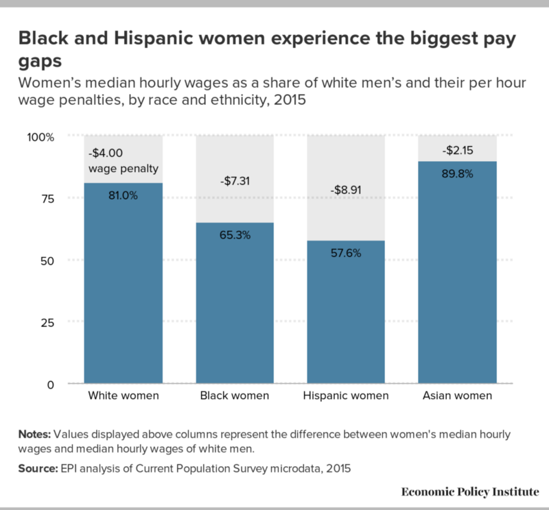
While women of all races and ethnicities are paid less than white men, the gap is widest for women of color, as this chart from the Economic Policy Institute (a liberal think tank) makes clear:

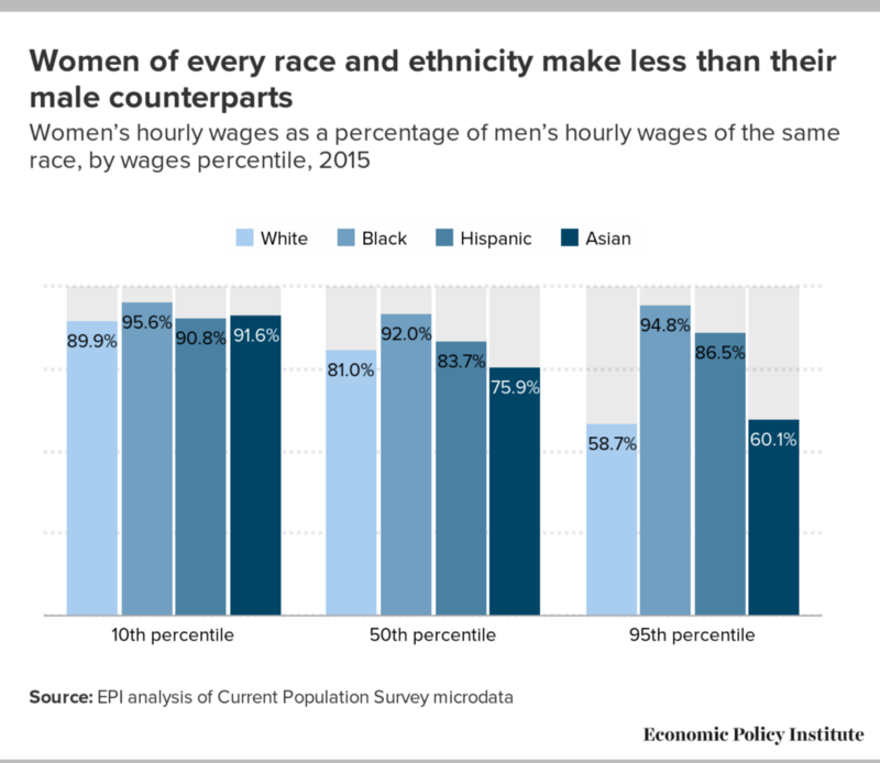
That’s not to say privileged white women are immune to the gender pay gap. This chart, also from the EPI, looks at pay gaps among different earnings groups. The biggest gap occurs among white women in the 95th earnings percentile, who are paid only 58.7 percent of what high-earning white men are paid.

So what’s to blame for the gap? The list is long and includes everything from blatantly discriminatory practices, to implicit biases throughout the hiring and salary negotiation processes, to voluntary occupational sorting, to the systemic devaluation of “women’s work,” to the “motherhood penalty.”
It’s not clear whether women will see much progress on this issue under the Trump administration. Not withstanding First Daughter Ivanka Trump’s morning Instagram post on the topic, the president recently signed an executive order revoking a number of President Barack Obama-era workplace protections.


