(Photo: Natural Resources Defense Council)
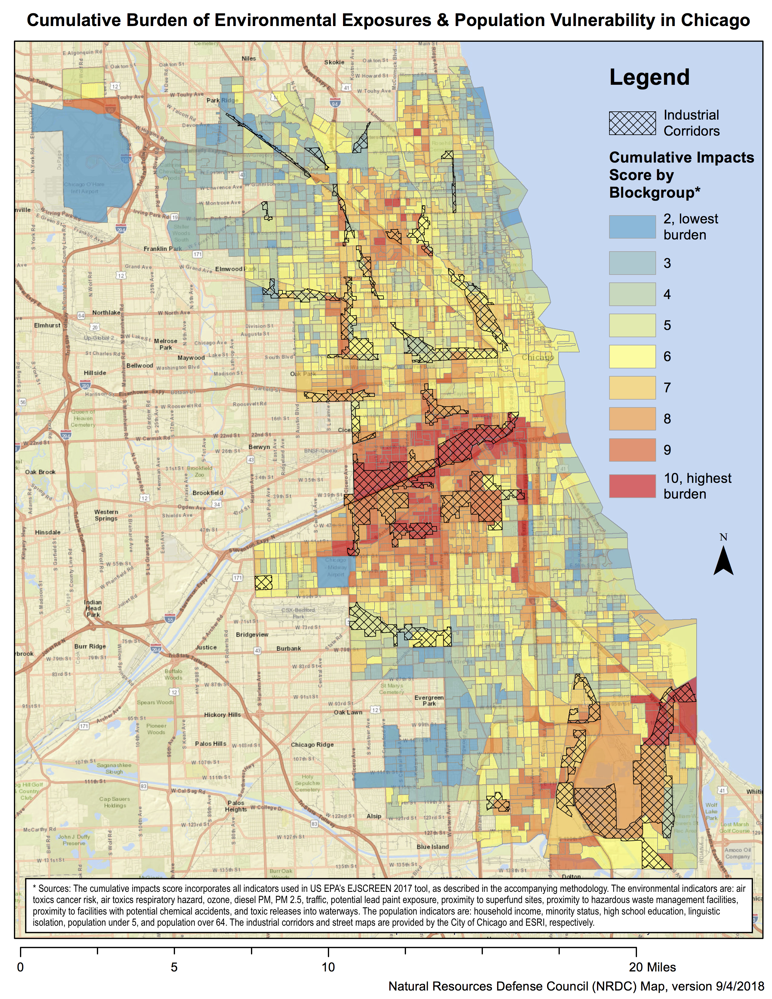
Chicago suffers from inequality in many forms, including uneven exposures to pollution and toxins throughout its many neighborhoods. Now, a sophisticated new map of the Windy City shows how, even among the dirtiest streets, not all pollution is created equal.
That’s because some neighborhoods are better equipped to handle these environmental risks than others—perhaps because they’re wealthier, or have more time, or enjoy closer access to their political representatives. Meanwhile, residents of low-income or high-minority neighborhoods can sometimes be all but forgotten by their representatives. It’s a distinction of which policymakers must be mindful when planning new developments in Chicago.
Created by the Natural Resources Defense Council, the new map combines both the environmental and socio-demographic characteristics of each Chicago neighborhood. It considers factors such as cancer and respiratory risks from air toxins, lead paint exposure, and proximity to Superfund sites; on the socio-demographic side, it incorporates poverty, minorities, linguistic isolation, and the percentage of young and old people.
Rather than simply mapping these factors against each other, the analysts combined the various indicators, showing their cumulative impacts. Each neighborhood was then given a “score” for overall vulnerability, which corresponds to a color on the map.
“The cumulative approach that we took is supposed to reflect that, basically, the same amount of pollution does not affect all people the same,” says Meleah Geertsma, an attorney at the NRDC, who helped to create the map. “Our goal was not just to show that environmental burdens tend to be borne more by certain populations, but that there’s an exponential impact of that disparate distribution of environmental hazards.”
While the map is based on data collected by the Environmental Protection Agency, the method used to combine all the factors was developed by academics in California, in an attempt to highlight issues relating to environmental justice.
The map, Geertsma says, will be valuable in the hands of Chicago communities that have long tried to make the case that they are disproportionately harmed by pollution, yet have been largely overlooked by the city’s government.
Indeed, Chicago’s local government has a history of helping its wealthier northside communities to shed the detritus of their industrial pasts, especially of the large “industrial corridors” slicing through the city, at the expense of its poorer southside communities.
In 2017, the Mayor’s Office and the Chicago City Council re-zoned a northside industrial corridor to welcome developments in commerce and technology. The same deal committed to mitigating losses in Chicago’s manufacturing sector by expanding industry in other areas, including Calumet, Pilsen, and Little Village—areas that the NRDC’s map highlights as particularly vulnerable.
“There was very little in the plan to even question whether these communities should be getting more of these heavy industries, let alone to say that those places already have too much,” Geertsma says. “We shouldn’t be increasing the disparities by moving more [industry] to [these marginalized communities] and making the northside cleaner at the same time.”
Another instance where the map could be useful is in deciding where to spend the money that Illinois was granted as part of a multi-billion-dollar settlement following Volkswagen’s emissions cheating scandal, Geertsma says.
“If you’re asking where should we target money to actually reach the communities most vulnerable to pollution, this map shows that people on the northside don’t really need additional money from the VW settlement to deal with pollution in their communities. They’re most likely doing relatively OK,” she says. “Other communities, on the other hand, are much more burdened by not just vehicles, but by a whole other range of factors, so let’s direct money there.”
While such outcomes are still to be decided, the map has already prompted greater collaboration between some of Chicago’s most polluted communities.
Gina Ramirez lives on the southeast side of Chicago, and is worried about the effect that manganese and lead—two toxins produced by local industry—will have on the health of her four-year-old son. Ramirez has been involved in several community groups over the years, including the NRDC, the Southeast Environmental Task Force, and the Southeast Side Coalition to Ban Petcoke, to try to force the city to clean up her neighborhood, but found that progress was slow.
“As community members, we’ve always been saying, ‘Why is it that black and brown communities are the ones that have to bear the brunt of this burden?'” she says. “This map really helps us, because we actually have the data to show it now, and we’re not just going by our observations.”
Since working on the map with the NRDC, Ramirez has created alliances with other community groups across the city, providing better information to other Chicagoans and pressuring the city council to stop issuing permits to polluting corporations. She has also presented the map in local high schools, hoping to raise awareness of the disproportionate impacts of pollution on children.
“We’re hoping that the City of Chicago notices that this isn’t fair, that we have to be sacrifice zones and subject our families to all these pollutants,” she says. “We hope that they really try to rezone some of these areas and make a more equitable Chicago.”
New Landscapes is a regular series investigating how environmental policies are affecting communities across America.


