The designers who decide defaults have immense, potentially life-saving power.
By Lena Groeger
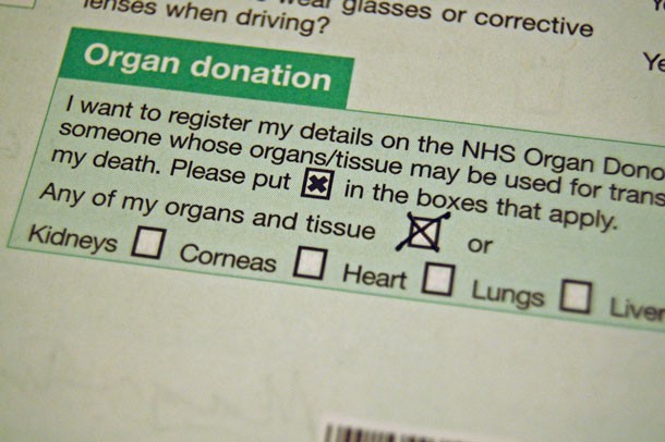
One small change at the Department of Motor Vehicles could increase organ donation rates dramatically. (Photo: David McNew/Getty Images)
We’ve seen how design can keep us away from harm and save our lives. But there is a more subtle way that design influences our daily decisions and behavior — whether we know it or not. It’s not sexy or trendy or flashy in any way. I’m talking about defaults.
Defaults are the settings that come out of the box, the selections you make on your computer by hitting enter, the assumptions that people make unless you object, the options easily available to you because you haven’t changed them.
They might not seem like much, but defaults (and their designers) hold immense power — they make decisions for us that we’re not even aware of making. Consider the fact that most people never change the factory settings on their computer, the default ringtone on their phones, or the default temperature in their refrigerator. Someone, somewhere, decided what those defaults should be — and it probably wasn’t you.
Another example: In the United States, when you register for your driver’s license, you’re asked whether or not you’d like to be an organ donor. We operate on an opt-in basis: that is, the default is that you are not an organ donor. If you want to donate your organs, you need to actively check a box on the questionnaire from the Department of Motor Vehicles. Only about 40 percent of the population is signed up to be an organ donor.
In other countries such as Spain, Portugal, and Austria, the default is that you’re an organ donor unless you explicitly choose not to be. And, in many of those countries, over 99 percent of the population is registered. A recent study found that countries with opt-out or “presumed consent” policies don’t just have more people who sign up to be donors, they also have consistently higher numbers of transplants.
Of course, there are plenty of other factors that influence the success of organ donation systems, but the opt-in versus opt-out choice seems to have a real effect on our collective behavior. An effect that could potentially make the difference between someone getting a life-saving transplant or not.

(Photo: Magnus D/Flickr)
Behavioral economist Richard Thaler and legal scholar Cass Sunstein pretty much wrote the book on the implications of defaults on human behavior. Nudge: Improving Decisions About Health, Wealth, and Happiness is full of ways in which default options can steer human choices, even if we have no idea it’s happening. Besides organ donation, the list of potential “nudges” include everything from changing the order of menu items to encourage people to pick certain dishes to changing the default temperature of office thermostats to save on energy.
But my favorite has to do with getting kids to eat their vegetables.
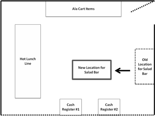
What if I told you there was one simple change you could make in a school cafeteria to get children to eat more salad? It doesn’t cost anything, force anyone to eat anything they don’t want, and it takes only a few minutes to fix. And it happened in real life: Amiddle school in New York moved its salad bar away from its default location against a wall and put it smack in the middle of the room (and prominently in front of the two cash registers, as seen in the diagram below). Salad sales more than tripled.

Putting the salad bar in a hard-to-miss location drove salad sales up 200 to 300 percent. (Illustration: Agricultural & Applied Economics Association)
You see the same effect when you change the placement of fruit in a lunchroom, or healthy snacks at the checkout counter.
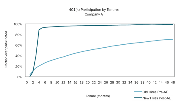
Another example is from the realm of personal finance. Most Americans are pretty bad at saving money for the future, especially for that ambiguously defined golden yonder called “retirement.” And the current defaults don’t make it any easier. Many companies’ retirement plans, like 401(k)’s, are opt-in: You have to hike over to human resources and get enrolled, and sometimes you have to understand a bit about investing. But an alternative strategy has seen massive success: automatic enrollment. This means that employees are enrolled by default, unless they decide not to contribute. Research shows that, under these circumstances, participation in 401(k)’s skyrockets and the retirement savings don’t appear to cut savings in other accounts.

Automatic enrollment in 401(k) plans increases participation rates dramatically. This chart shows that, for one company, participation among new hires rose from less than 20 percent to over 90 percent. (Chart: Defined Contribution Institutional Investment Association)
As an added bonus, unlike tax subsidies for contributing to your retirement savings, automatic enrollment programs cost the government nothing.
It’s true that the same mechanism that gets so many people enrolled in the first place (it’s the default), keeps them stuck at the low default contribution rate (often 3 percent). That’s not much.
To combat the problem, many employers now implement automatic escalation, which means you agree upfront to raise your contribution by 1 or 2 percent every year. One variation of automatic escalation called “Save More Tomorrow” ties the increased contribution to your next pay raise, so you don’t “miss” the money so much. In a 2013 paper in Science, Thaler estimates that automatic escalation programs have boosted annual savings by $7.4 billion. Little defaults can add up to a lot of cash.
Defaults could also help get out the vote. Automatic voter registration would automatically sign up eligible citizens to vote when they interact with government agencies (say, to get their driver’s licenses). Instead of our current cumbersome and error-prone system that says you can’t vote unless you register, this modern reform would default to registration unless you opt out. Five states have already approved automatic voter registration measures and 24 more are considering legislation.
While some defaults might only come up once a year or on Election Day, others seep into our most mundane daily activities. Take, for example, the default font of your favorite word processing program. For many, that’s Times New Roman. It was not only the default font of Microsoft Word for many years, but since its early days as a newspaper typeface it has managed to infiltrate books, magazines, legal documents, high school essays, and almost every personal computer around the world. Times New Roman has permeated every crevice of textual society — so much so that Matthew Butterick, author of Typography for Lawyers, calls it the “default font of everything.” He goes on to say:
When Times New Roman appears in a book, document, or advertisement, it connotes apathy. It says, “I submitted to the font of least resistance.” Times New Roman is not a font choice so much as the absence of a font choice, like the blackness of deep space is not a color…. If you have a choice about using Times New Roman, please stop.
Of course, it didn’t help that early Web browsers also defaulted to rendering text in Times New Roman. The results left us with the canonical early-’90s Web that is so familiar today

Times New Roman is not the only notoriously hated default. Much to the chagrin of designers everywhere, Adobe Illustrator’s default font is Myriad Pro.
And don’t even get chart makers on the subject of Excel default chart styles. More than one extensive blog post has been written about how to convert Excel’s defaults to passable looking graphics.
Defaults can also reflect a legacy of attitudes we’re not proud of. The default skin color, in things like “flesh-colored” Band-Aids and crayons, was long a light tan or peachy color — hardly a reflection of the diversity of human skin tones. More recently, the default images for emoji icons depicting humans had light skin tones, and only recently have other tones been available. The default is a cartoonish yellow (which is still controversial), but some smartphones now at least give people the option to pick their own default from a more diverse selection of colors.
Oftentimes, your default situation is determined by outside forces (the company you work for, the country you live in, Adobe’s whims). But not always.
In many cases, you can change the defaults yourself. For example, designer David Kadavy suggests re-arranging the icons on the home screen of your smartphone — strategically. The trick is to bring forward the applications you want to use the most, not the ones you already use the most. As Kadavy puts it: “If you design your world to make it hard to do things that are bad for you, and easy to do things that are good for you, your behavior will shape to that design.”
You can probably imagine all the ways you could re-design the defaults around you to steer your own behavior. Re-arrange the pantry to make junk food harder to reach. Put your running shoes by the bed so you see them first thing in the morning. Bury the Facebook app on your phone. Set up automatic deposits from your paycheck to a savings account so you don’t have to remember to transfer money every month. Change the default font to anything but Times New Roman.
So what are you waiting for? Go on and change some defaults.

||
This story originally appeared on ProPublica as “Set It and Forget It: How Default Settings Rule the World” and is re-published here under a Creative Commons license.


