Our brains fool us all the time. And we typically have no idea that it’s happening.
By Lena Groeger
Chances are, you probably think your mind works pretty well. It might lead you astray now and then, but usually it helps you make good decisions and remember things reliably. At the very least, you’re probably confident that it doesn’t change depending on the time of day or what you had to eat.
But you’d be wrong. Our brains fool us all the time. And we typically have no idea that it’s happening.
Let’s look at some of the wacky things our minds make us think and do. And then we’ll examine how graphics, including charts, interactives, and other visual tools, can help show us our mind’s shortcomings.
Our Mind’s Everyday Quirks
We’ll start with a study of Israeli judges done by researchers at Ben-Gurion University of the Negev in Israel and Columbia University. They were looking at what caused judges to rule the way they did. A favorable ruling could mean, for example, granting parole or moving a prisoner to a different prison. You might expect that a judge’s decision would have something to do with how serious the crime was or how much time had been served already, or how many times a prisoner had gone to jail before. But these researchers found something else that had a huge effect on a judge’s ruling: lunch.
Yup. Quite literally, whether or not a prisoner got a favorable ruling depended in part on how long it had been since the judge had something to eat.
As you can see in the chart, the rate of favorable rulings starts at around 65 percent early in the day, then drops to almost zero, and then spikes back up again after the judges come back from a meal break.
The paper ominously concludes: “Indeed, the caricature that justice is what the judge ate for breakfast might be an appropriate caricature for human decision-making in general.”
Let’s move now to an entirely different part of the world: Texas. The airport in Houston had a problem.
Passengers were complaining about the inordinately long time they had to wait to pick up their bags. The airport decided to look more closely at the baggage collection process. They found that passengers typically got off an airplane, walked for about a minute from the gate to the baggage claim carousels, then waited about seven minutes for their bags. That is, most of their time was standing around and waiting.
So the airport changed the location of baggage claim so that it was further from the arrival gates, which meant that passengers were now walking for seven minutes and waiting for only one. The complaints stopped.
The total time between gate and bag hadn’t changed at all — but the perception of time passing made all the difference.
Besides being dependent on snacks and hating to wait, we’re also very bad at predicting the future, even if our minds convince us otherwise.
Just take a look at the average investor:
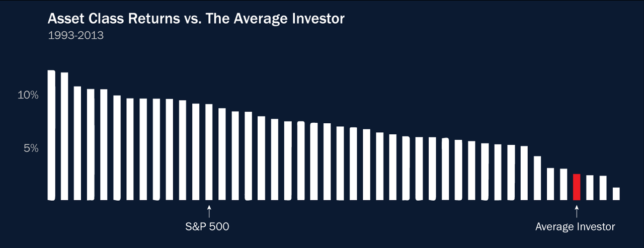
Fidelity did a study of all their accounts to see what types of investors performed the best. They found that the best investors were the people who had either forgotten they had an account in the first place — or were dead! In other words, most investors succeed in doing the exact opposite of what they set out to do with their money (presumably, make more of it).
Mental tendencies like loss aversion (we regret losses twice as much as we enjoy the equivalent gains) lead us to pull money out of the market when we shouldn’t. Our own minds sabotage our best intentions.
Some of our most peculiar mental quirks highlight just how temperamental our judgments can be. In one study, people holding heavier clipboards perceived issues as more important and more expensive than the people holding lighter clipboards. In another study, people holding a hot cup of coffee judged strangers they met as more warm and friendly than the people who were holding a cold glass of iced coffee.
Now, keep in mind that some of these studies have been more rigorously tested and replicated than others, and you should pause before swapping out all the clipboards in your office and banning iced coffees. But at the very least these findings hint at a much richer (and much more complex) interplay between our environments, our bodies, and our minds.
In fact, the associations of “weight” with “authority” or “warmth” with “affection” may seem to be the stuff of metaphor, but they are, in fact, deeply internalized. According to linguist George Lakoff, we internalize these metaphors because of repeated experiences we have in the course of ordinary life. For example, a child’s experience of affection is often correlated with the warmth of being held. Over time these associations are drilled into our mind as conceptual metaphors (affection is warmth). Once established, these unconscious metaphors drive us to make judgments and decisions, in some cases based on entirely irrelevant factors.
Just the way I say something can have a huge effect on what you think about it. This is an effect called framing. Suppose your doctor suggests an operation and then says: “of 100 people who have this operation, 90 are alive after five years.” Do you want the operation?
What if your doctor told you “of 100 people who have this operation, 10 are dead after five years.” Now do you want the operation? The same exact information, framed in two different ways, can drastically alter people’s choices (and does in study after study).
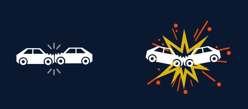
Small words can even change our memories, an effect called priming. In one study, subjects watched scenes from a car crash. Then, some were asked “How fast was the car going when it hit the other car?” Others were asked “How fast was the car going when it smashed into the other car?” The people who heard smashed estimated the car was going much faster than those who heard hit, and some even “remembered” seeing broken glass at the scene of accident, of which there was none.
In addition to memory, our own tastebuds can be altered by seemingly trivial details of our environment. Did you know that eating soup out of a blue bowl makes it taste saltier? I didn’t either. For more on the connection between sight, sound, and taste, read this incredible New Yorker article.
These are just a few of a huge numbers of fallacies, biases, errors, illusions, and blind spots that rule the inner life of our brain every single day. When you’ve flipped heads five times in a row and think that tails is somehow “due,” that’s a misperception called the Gambler’s Fallacy. The chances you’ll get heads on the sixth flip is exactly the same as it was the first five times.
When people vote for a candidate just because they’ve heard her name before, that’s the Salience Effect. Here’s a handy list of almost 100 of these mental quirks, compiled in the book The Art of Thinking Clearly by Rolf Dobelli:
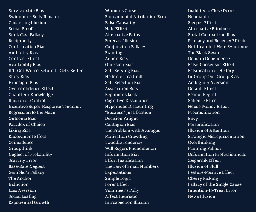
Even if these cognitive errors seem obvious in retrospect, they are very hard to dismiss. Simply knowing about the Sunk Cost Fallacy doesn’t mean we don’t have a hard time walking out of a movie theater if the film is terrible. And as we move into more serious contexts, these seemingly harmless peculiarities of the mind can have dramatic consequences.
Especially in contexts when our decision making depends on visual evidence.
Visuals Fool Our Minds Too
In one study of Florida inmates, prisoners with faces rated as less “trustworthy” were more likely to have gotten the death penalty than faces rated as more trustworthy. This was true even if the prisoners were later found to be innocent of their accused crime. In other words, a prisoner’s looks could have had a very real affect on whether he or she was sentenced to live or die.
Furthermore, people tend to rate evidence as more credible when it’s paired with scientific-looking imagery. The fact that brain scans are making their way into more and more courtrooms may be of some concern since neuroscience is still far from being able to say much at all about crime, especially how it relates to a picture of your brain. One recent study found that judicial opinions referring to neuroscience as evidence doubled between 2005 and 2012.
So what can we do to either fight or expose these biases? I believe that graphics can come to the rescue here, and are already in a great position to show people just how irrational we can be. And if you don’t believe that graphics have that kind of power to steer our thoughts, just consider the following experiment. It happens to be my all-time favorite study of bar charts.
Psychologist Barbara Tversky, then at Stanford University, decided to show two groups of people the same information: average height of men and women. Here’s are the two charts she created to represent this data:

When presented as a bar chart (left), people understood the data pretty well, saying things like: “Men, on average, are taller than women.” But the group that saw the line chart (right) said things like “The more male a person is, the taller he/she is.” Think about that.
Our intuitions about how to read lines as trends are so strong, that they lead us to say totally nonsensical things. The power of graphics is strong! Of course, some of these powerful intuitions are learned. We weren’t born knowing how to read line charts, as the several-paragraph-long description in this early news graphic demonstrates. Over time, after seeing charts in school, on the Web, in our daily life, we accumulate the vocabulary to read them.
But part of this intuition also comes from how our brains process visual information. Before activating our conscious thought to understand an image, we unconsciously absorb tons of information very quickly (what’s called “pre-attentive processing”). That puts graphics in a superb position to harness this ability to combat some of our mental shortcomings.
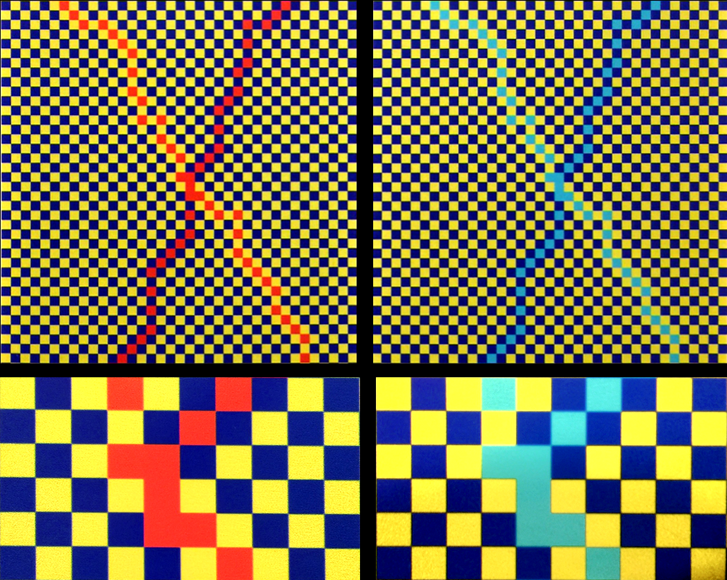
And, in fact, graphics have been showing us our mental flaws for a pretty long time. They’re called optical illusions.
Here, two sets of crossed lines (one red, one blue) look like they are composed of two very different shades. In fact, they are the same color. You probably won’t believe me until you look at the close-up at the bottom.
These lines looked curved, but are actually parallel and straight:

This shelf seems to make sense, until you realize it doesn’t:

These two lines are really the exact same length:

And no matter how hard you look at these two tables, you will never actually believe that they are the same shape and size:
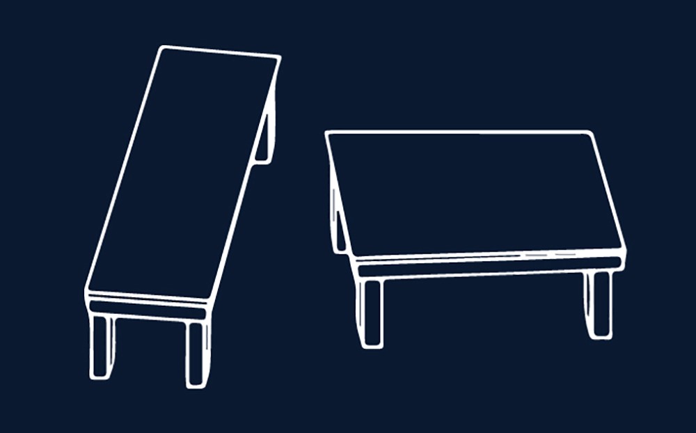
Here’s a GIF to prove it to you:

While many of these optical illusions may seem arbitrary, they actually exist to let us see and understand the world successfully. We see these tables as different sizes because our brain’s visual processing system is phenomenal at judging lengths in three-dimensional space. But let it loose in a slightly different context (like two-dimensional space), and this same system totally fails.
Here’s a fun one. Look at the dancer in the center and note which way she’s spinning. Then look at either the left or the right. All three are the same image, but you’ll likely see her spinning in opposite directions.
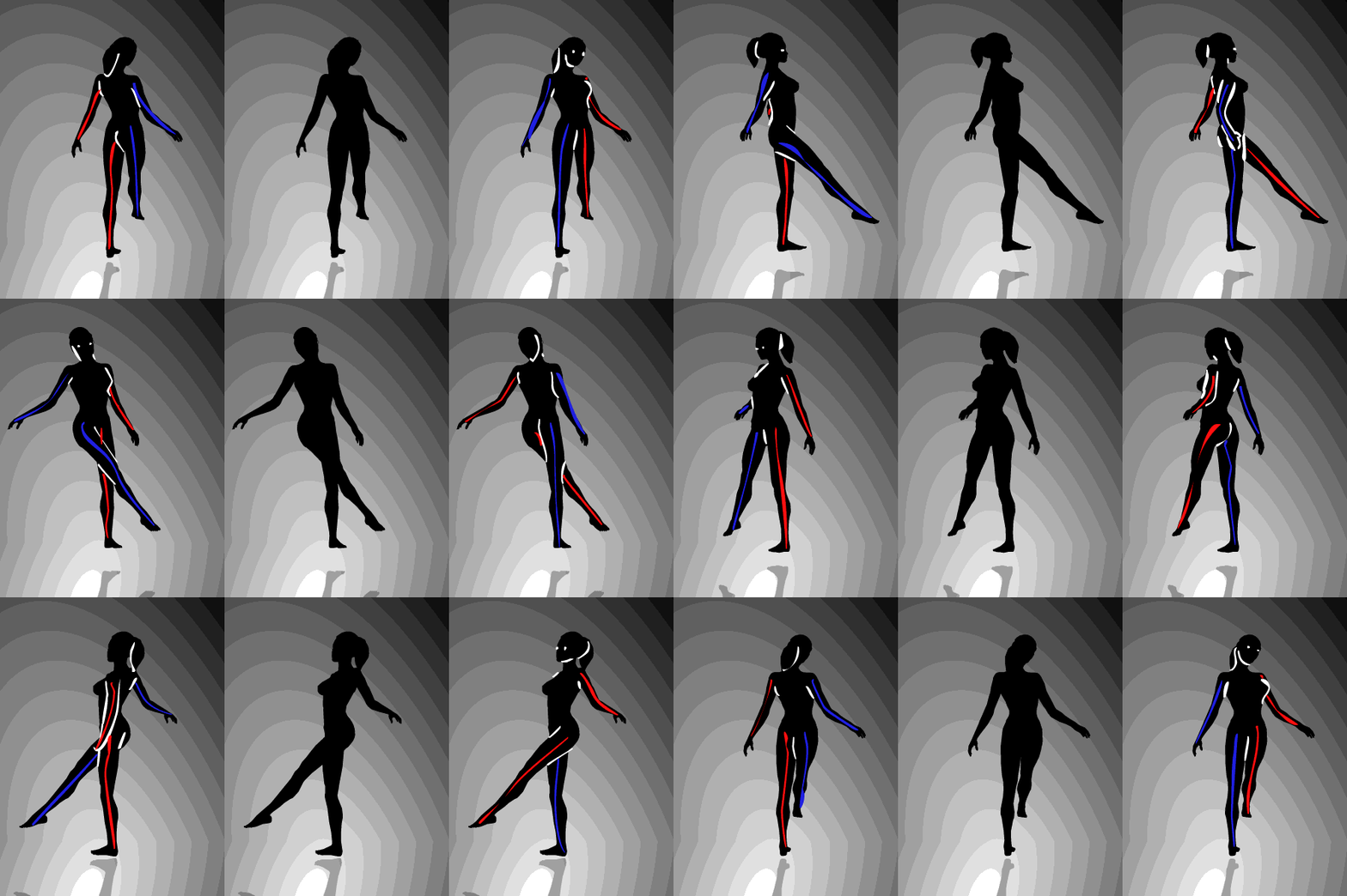
Optical illusions are great. They’re fun, they’re quick, and they teach us a lot about how our eyes and brains work together to fail us. But remember that big list from earlier? We have dozens of mental quirks that don’t have anything to do with visual processing, such as framing or unconscious bias. This is where news graphics and interactives come in. In the old tradition of optical illusions, they can help reveal our blind spots to us. Some already have!
Graphics Can Reveal Our Blind Spots
Here’s an example from the New York Times which shows how the latest jobs report could be read two very different ways depending on your political leaning. Many of us have heard of confirmation bias (the idea that we look for information to support what we already believe) and this graphic really drives that point home:
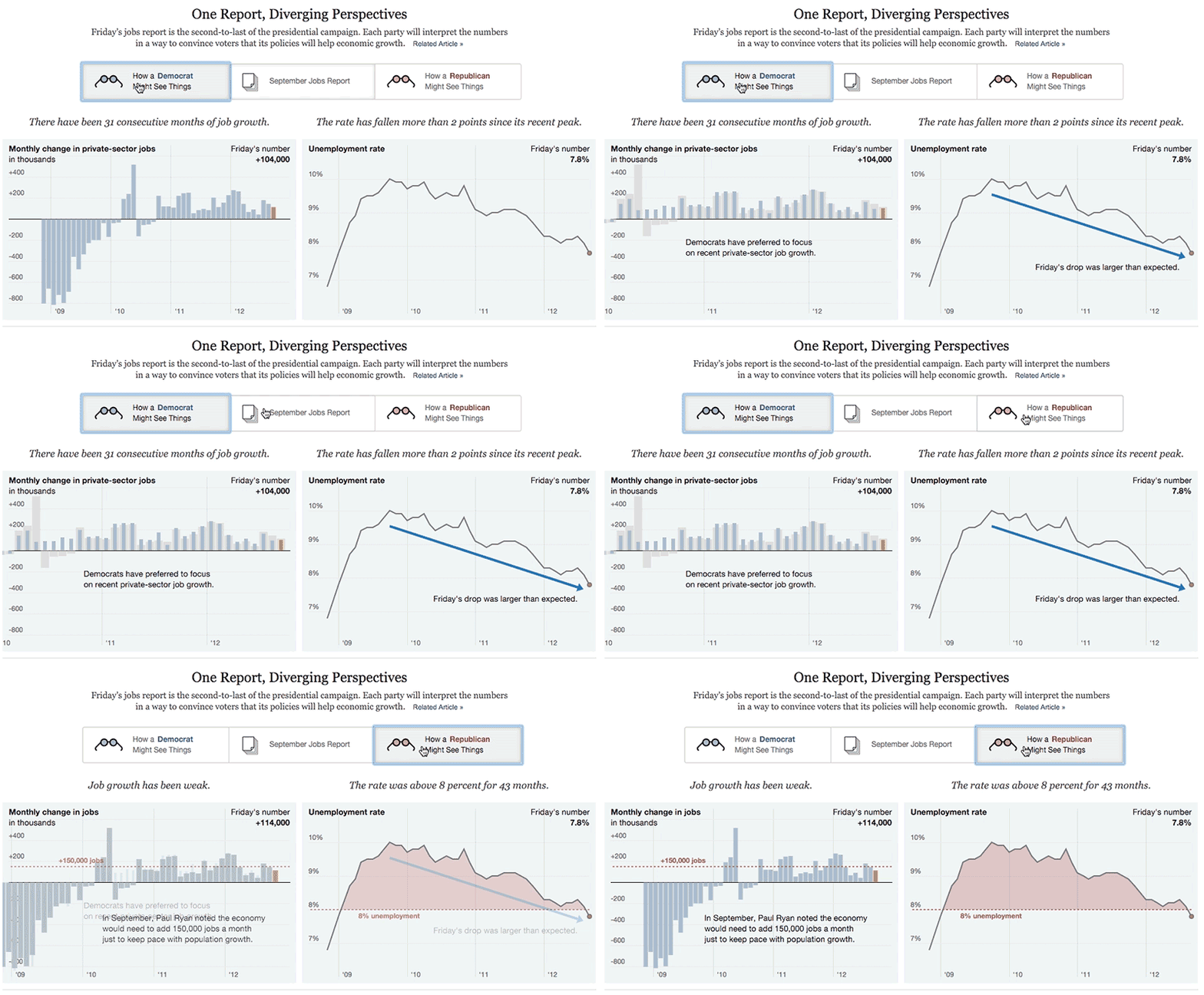
And if the last example helped us see through politically colored glasses, this next one helps us see through a different sort of lens.
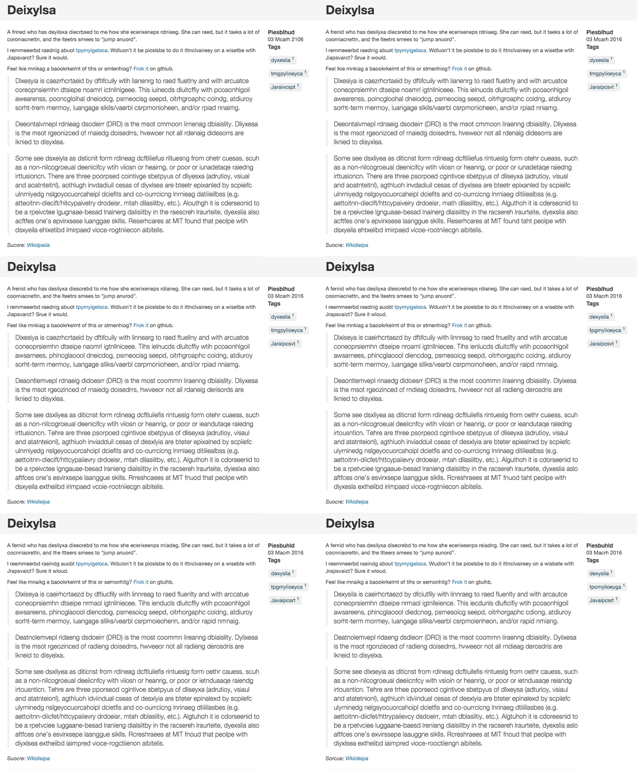
It’s a simulation of what it might be like to have dyslexia. The person who created it was inspired by a friend with dyslexia who said that, for her, letters seemed to “jump around.” It ingeniously uses something visual to hint at what we might take for granted if we don’t have this difficulty.
Another thing we’re really bad at: comprehending large numbers. A number of newsrooms have come up with interesting visual ways to convey scale.
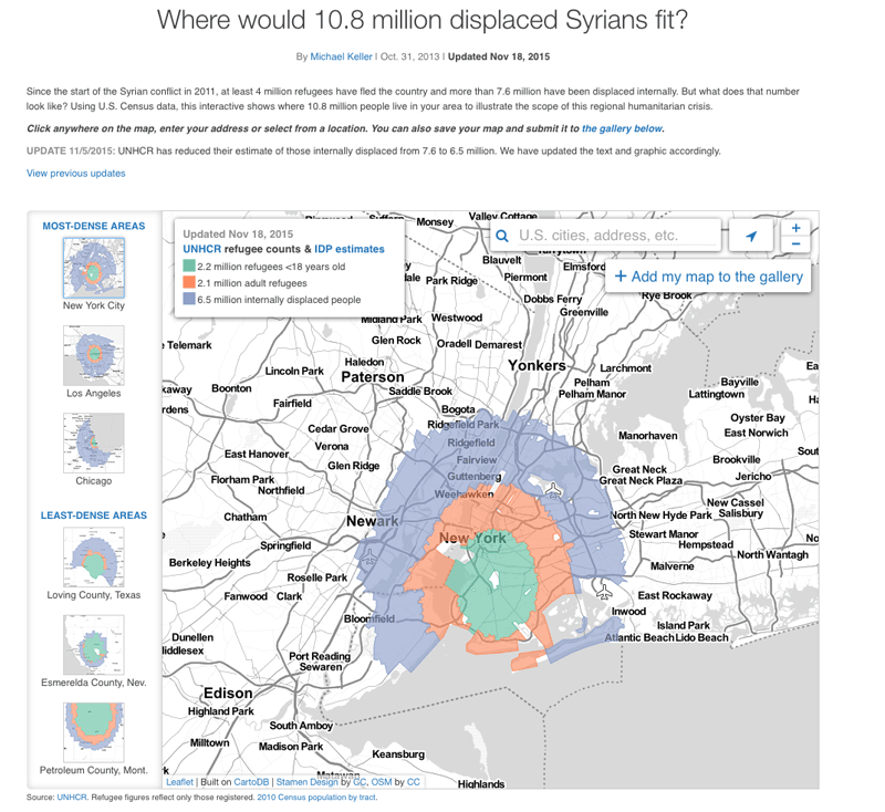
One strategy is to map these numbers onto unexpected geographies. Al Jazeera tries to show us what 10.8 million Syrian refugees looks like by showing us where the same number of people live in various parts of the United States:
The South China Morning Post uses this strategy to imagine what would happen if an atomic bomb hit various cities all over the world:
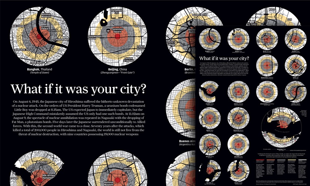
Remember pre-attentive processing, the ability of our brains to quickly take in huge amount of visual information before our conscious thought catches up? The previous two graphics take full advantage of this system. So instead of trying to grasp the abstract number of 10.8 million, I get to immediately see it represented in circular bands around actual cities, at a scale I can understand.
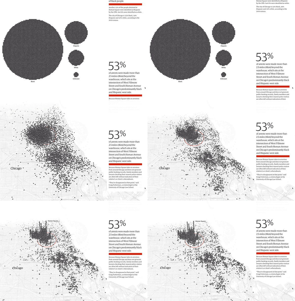
Another way to give us a sense of scale is to use lots and lots of tiny dots. Dots seemed to really come into their own in 2015, in many cases used to represent a large number of people in a very powerful way. The Guardian uses dots to highlight the over 7,000 people detained by the police and taken to Chicago’s Homan Square:
Other times we see what Jeremy Singer-Vine calls the “rhetorical scroll,” using a scrolling to help us grasp large numbers. The New York Times used it to show us just how many homes were on the brink of foreclosure in 2014:
The Washington Post used this technique to show us just how far underwater signals could be detected from an airplane’s “black box”:

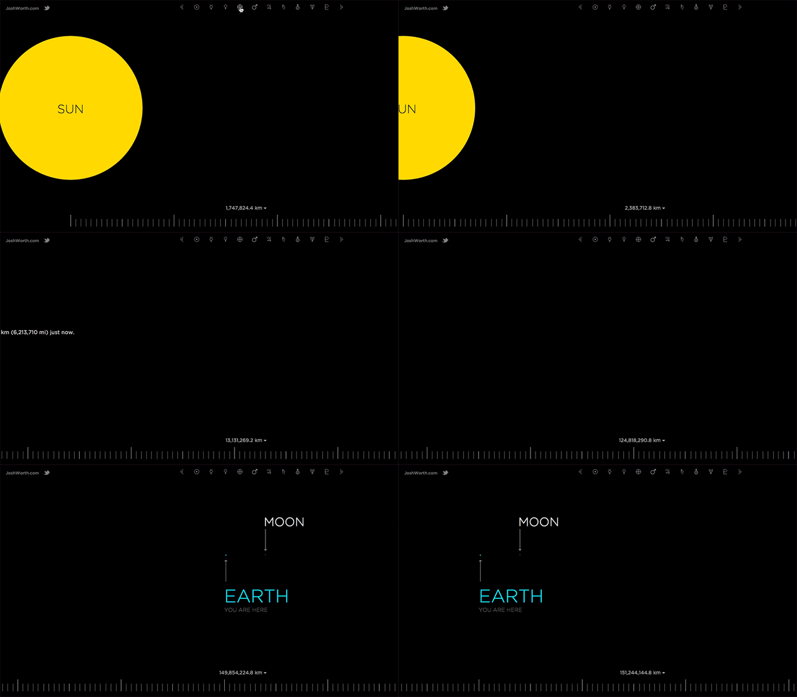
Here, Josh Worth uses side-scrolling to show the distance between planets in our solar system:
Here’s another one from the New York Times that uses every trick in the book and combines both dots and rhetorical scrolling to illustrate the number of people killed in the Syrian conflict:

Some graphics and interactives use a slightly different technique to show us how fooled we are by our own minds: they put the user in the drivers seat. These “you do it” graphics depend on the user actually doing something to fully understand the story or point.
In this interactive, Bloomberg has set up a simulated stock market where you buy a stock, hold it for a time, and then sell it at some point of your choosing. It’s not that long before you realize that your day trading skills are perhaps not that great. If more people played this game, perhaps the Average Investor from the earlier chart would perform a bit better.

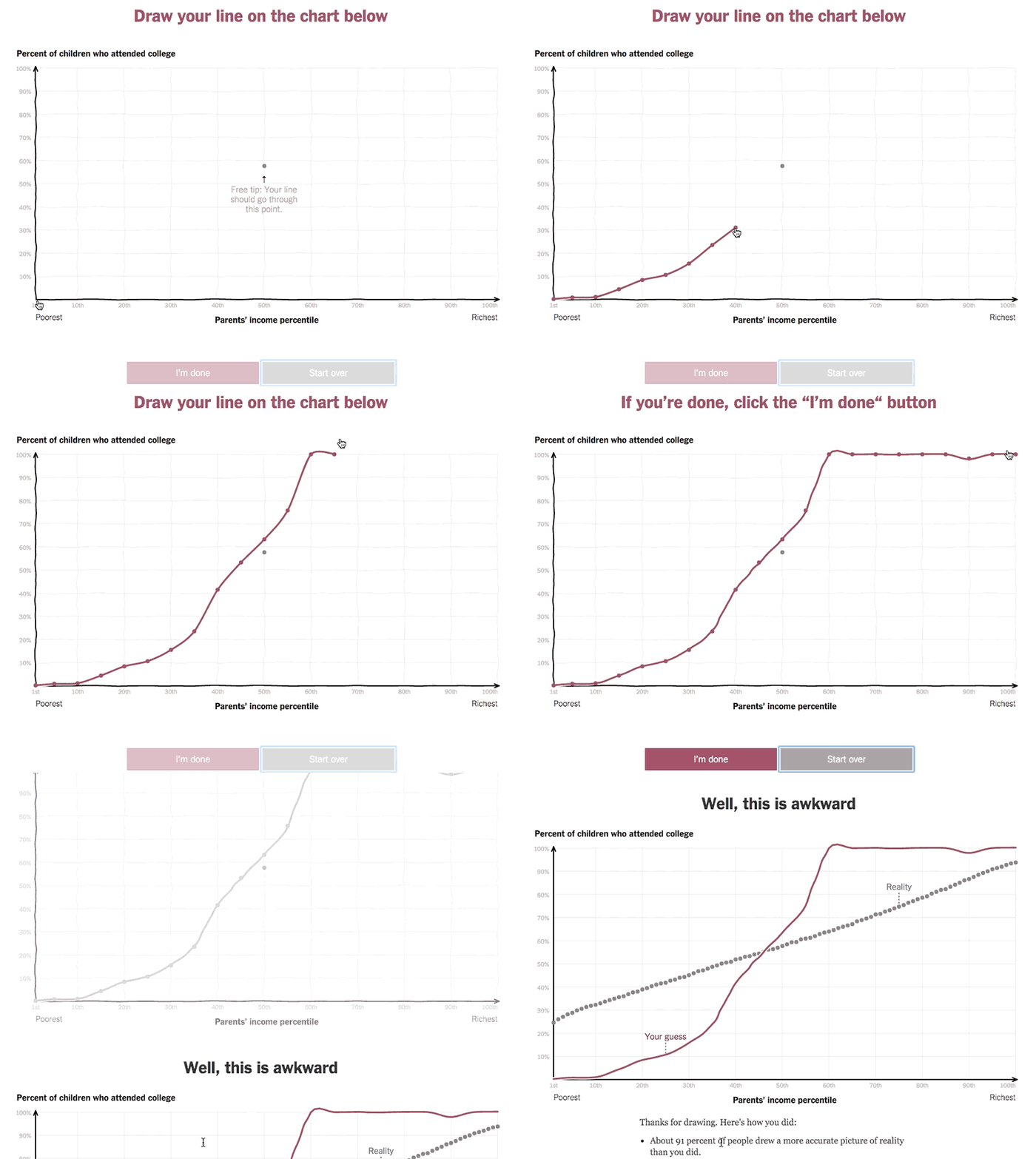
Or in this New York Times example, where you have to guess what the relationship is between parental income and children who attend college.
Rather than just tell you, they invite you to draw it! Afterwards, you get to compare your line to the actual trend. The act of physically drawing a line forces you to really think about the issue (hmm, well, I think many poor kids don’t go to school, so I’ll start low. But I think almost all rich kids do, so I’ll quickly draw up to the top and then stay high). When you then confront the reality, it has the potential to really surprise you.
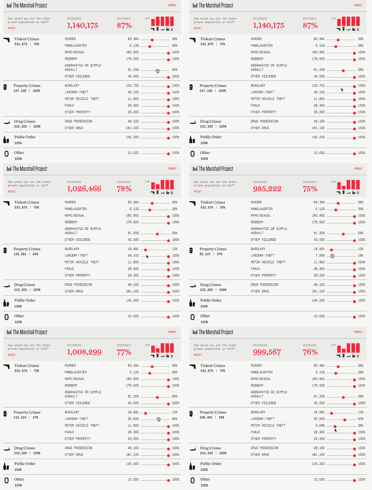
Here, the Marshall Project asks you to adjust a number of factors to see if you can reduce the prison population by half. In the process you may realize that without being more lenient on violent crimes (not something a lot of people want to do), it may be impossible to reach that goal:
In this example, the Los Angeles Times has you actually play the lottery, and helps you realize that even if you spend a ton of money you will likely never win the jackpot:

This New York Times interactive simulates what it’s like to live on minimum wage. As you enter in your expenses for food, rent, health care, etc., you see your money rapidly disappear. And as you are faced with real decisions about what to cut and how to save, you may gain a tiny sense of what life is like for someone who must make these decisions every day.
You may have noticed by now that in some of these graphics, what we realize is not just something about ourselves (wow, I’m terrible at the stock market) but something about others (wow, it’s pretty hard to live on minimum wage). In a way these “you do it” graphics are like digital empathy tools. When we’re forced to make a decision or do something we don’t normally have to do, we get a glimpse into what it might be like to be another person. I believe we can take the idea much farther.
Finally, one of my all time favorites in this genre is an interactive game called the “Parable of the Polygons.” In the game you have to follow certain rules about where to move a collection of blue and yellow shapes, for example: “I will move if less than 1/3 of my neighbors are like me.” Then you drag these shapes around until they are all happy with their neighbors. But here’s the catch: even slight preferences for similar neighbors leads very quickly to totally segregated populations of blue squares and yellow triangles.
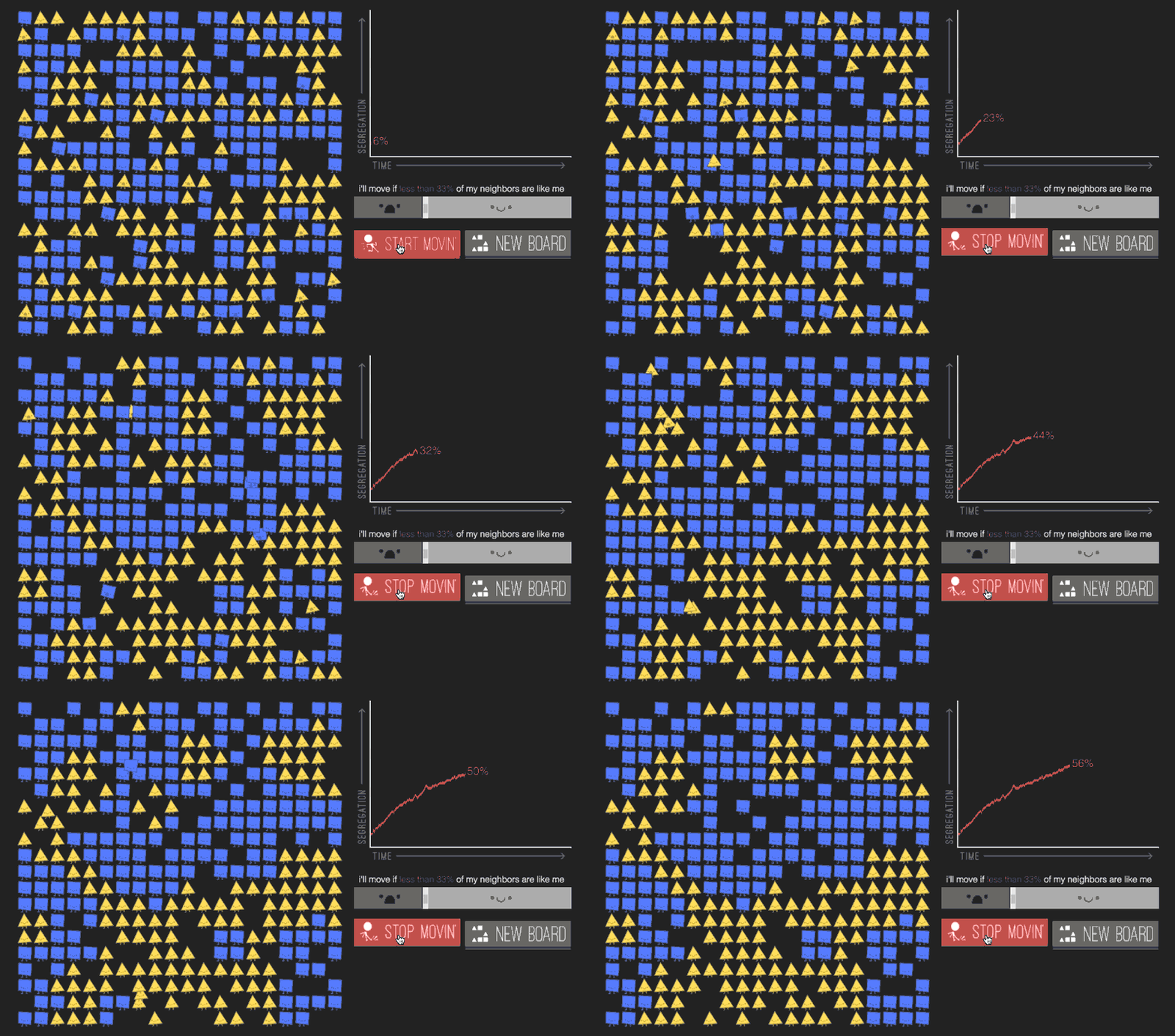
So by playing this game you quickly realize how small biases in society can lead to widespread segregation — fast. Another section of the game shows you how difficult it is, once segregated, to integrate these blue and yellow shapes back again. It takes an active preference for diversity to change the system.
I love this: A game that tackles systemic racism! I’d love to see more interactives trying to explain big intangible issues like this one.
We’re only at the very beginning of taking advantage of the ways graphics and visuals reveal our mental errors, our biases, our very bizarre behavior and our blind spots — to our own minds and to the situations of other people. I believe interactives, especially “you do it” graphics, can help. But given the length of this list, I suspect we’re going to be busy at it for a while.

||
This story originally appeared on ProPublica as “How Information Graphics Reveal Your Brain’s Blind Spots” and is re-published here under a Creative Commons license.


