Thirty-year-old Bay Area resident James Barclay has what he calls a minor case of dyslexia. “Learning how to read was a sensitive part of my childhood,” he says. “I struggled really hard as a child and it took a lot of work and years before I was able to bring myself up to my grade’s reading level.”
Turning to Calvin and Hobbes instead of Where the Red Fern Grows helped. Reading large volumes of text was tiring, he says, but comic books’ combination of words and pictures kept Barclay interested. “Comics were a clever trick to entice me into reading more even after I was tired of working that part of my brain,” Barclay says. While reading is easier for him now, Barclay is still a fan of Fables, Saga, Watchmen, and Persepolis. And the “clever trick” he discovered for himself in the 1990s, using comics to ease his relationship with written words, is by now widely known to and used by many educators and dyslexic readers.
Research suggests why comic books can help dyslexic readers make sense of a narrative. The Yale Center for Dyslexia & Creativity has noted that, in general, short snippets of text and typographic choices like sans serif fonts, bold text, large letters, plenty of space around characters, and no italics make texts easier for people with dyslexia to read. And research from Carnegie Mellon University postdoctoral fellow Luz Rello, who founded the social enterprise Change Dyslexia, has suggested that text in italic fonts significantly decreases the reading speed of people with dyslexia, while texts with sans serif fonts significantly increases their reading speed. “If we extend the results from previous research, comic books share some parameters that were found to be beneficial for people with dyslexia,” Rello says. Many comic books use larger fonts than novels do, for instance, which can be beneficial for those with dyslexia.
And yet, comics are still failing dyslexic readers in one important regard: lettering. While lettering is only one way to improve accessibility to a text-based story for dyslexic readers—the number and complexity of words and the placement of words on the page are also factors—lettering style is one of the most easily transformable characteristics. And, in general, text in all capitals—in 2017, still the standard format for speech bubbles and narration in comic books—is harder for dyslexic people to read than mixed-case text.
While dyslexic individuals have distinct preferences for formatting, dyslexia support organizations including the Dyslexia Association of Ireland and Dyslexia Action recommend that dyslexic individuals avoid all-capital letters: All caps can cause letters to blur together for readers with dyslexia and visual stress. In contrast, mixed cases allow for more variety, which helps to keep letters distinct. “Case sensitivity can be helpful in reorganizing words,” Barclay says.
Both dyslexic and non-dyslexic readers tend to have an easier time reading mixed-case letters. Hugh Catts, the director of the School of Communication Science & Disorders at Florida State University and a researcher into language-based reading disabilities, explains that, because most of what we read is in mixed case, the formatting is easier to process. “For all readers, those with dyslexia included, we read words more accurately and quickly when they are in mixed cases than when they are in all caps,” Catts says. The upshot is that what’s “hard for the good reader is going to be even harder for an individual with dyslexia.”
Yet comics have predominantly used all-caps lettering for both speech balloons and other text since the early days of mass-produced comics in the late 19th and early 20th centuries. In the early days of comics, typesetting was faster and easier when the characters had more uniform shapes. All caps was an especially useful format for letterers when they had only a small space for significant amounts of text.

(Photo: Courtesy of Luke Healy)
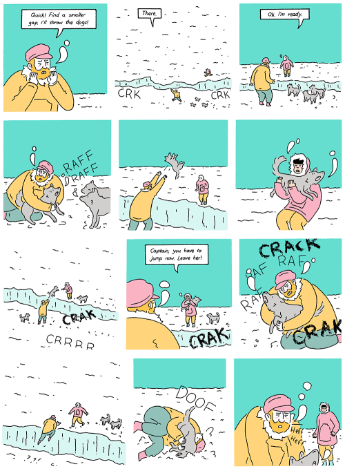
“All-caps lettering was probably more reliable to reproduce en masse across the thousands of copies of each newspaper that needed to be run off a printing press,” Luke Healy, the author of How to Survive in the North says. Today, it’s no longer necessary for comic publishers to use old-school printing presses, but the tradition of upper-case lettering remains. “At school,” says Healy, a graduate of the Center for Cartoon Studies, “I was taught to letter everything all caps.”
All-caps lettering has practical benefits too, according to several comics artists I spoke to. Aditya Bidikar, a letterer who has worked on projects including Motor Crush, Transrealities, and Stan Lee’s Chakra the Invisible, says that, with mixed cases, “line spacing is a lot wonkier.” Lowercase letters have ascenders and descenders—the line that points up in “d,” for example, or the curve that dips down in “g”; compared to “DOG,” “dog” creates more blank space in a line.
Bidikar says that, in large part, letterers choose all-caps lettering because it’s conventional in comics. But all caps’ traditional place in comic books has also prompted some artists to reject the format too. Despite his all-caps training, Healy now uses mixed-case lettering because he finds it easier to read and associates it with more novelistic, character-based writing. “For me, all-caps lettering fits the more bombastic, fantastic stories that [superhero] comics tell,” he says. “My comics are quieter, and I’d rather have the lettering create a mental link for the reader with prose novels.”

(Photo: Imgur)
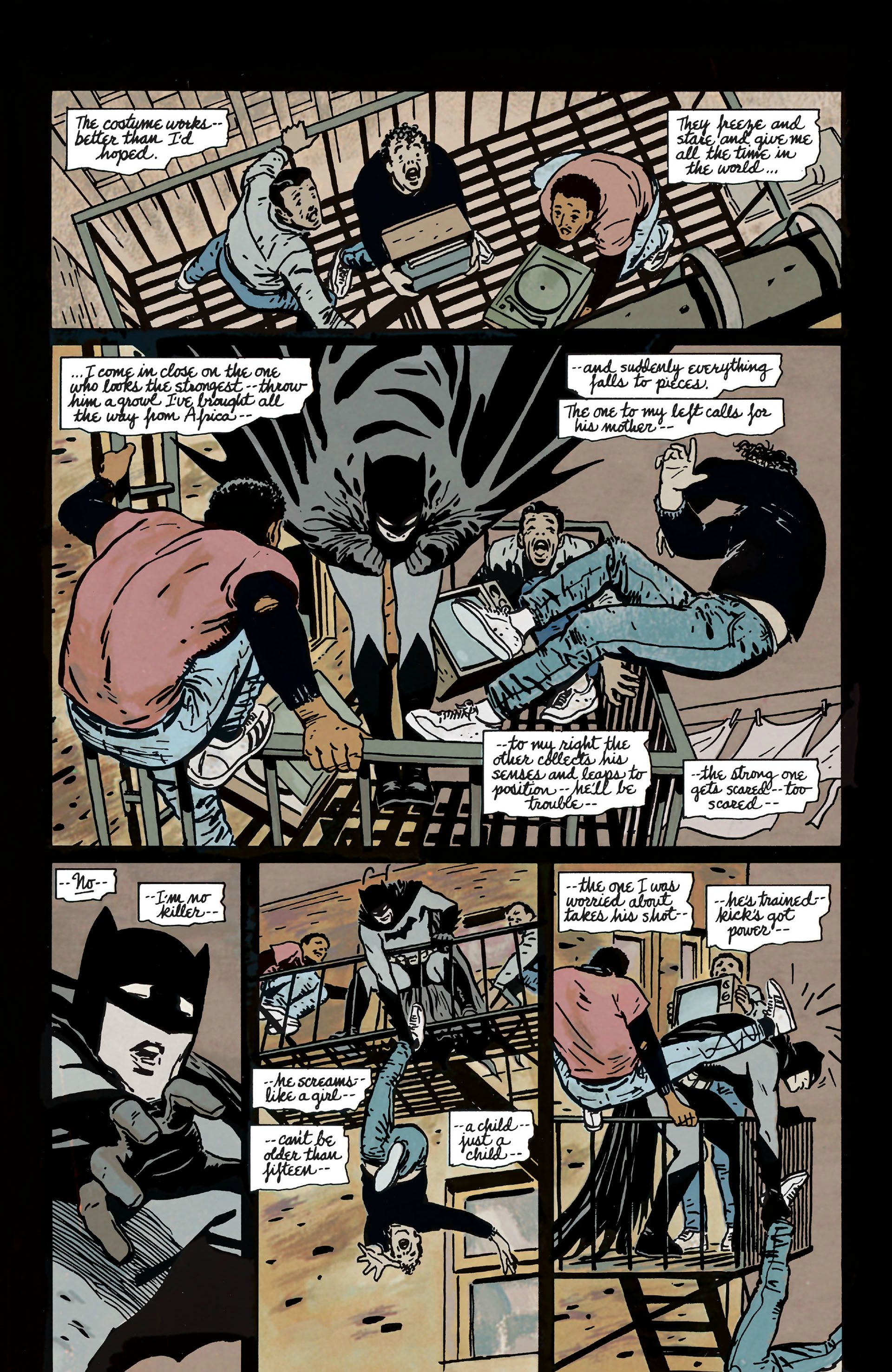
Others in the comics industry have also bucked convention, with mixed results. In 1986, Frank Miller’s seminal graphic novel Batman: Year One featured mixed-case captions over all-caps thought and speech balloons. In 2002, the former vice president of Marvel Comics, Bill Jemas, pushed for letterers to use mixed case in all of the company’s books, but this policy petered out two years later, once he had departed from Marvel.
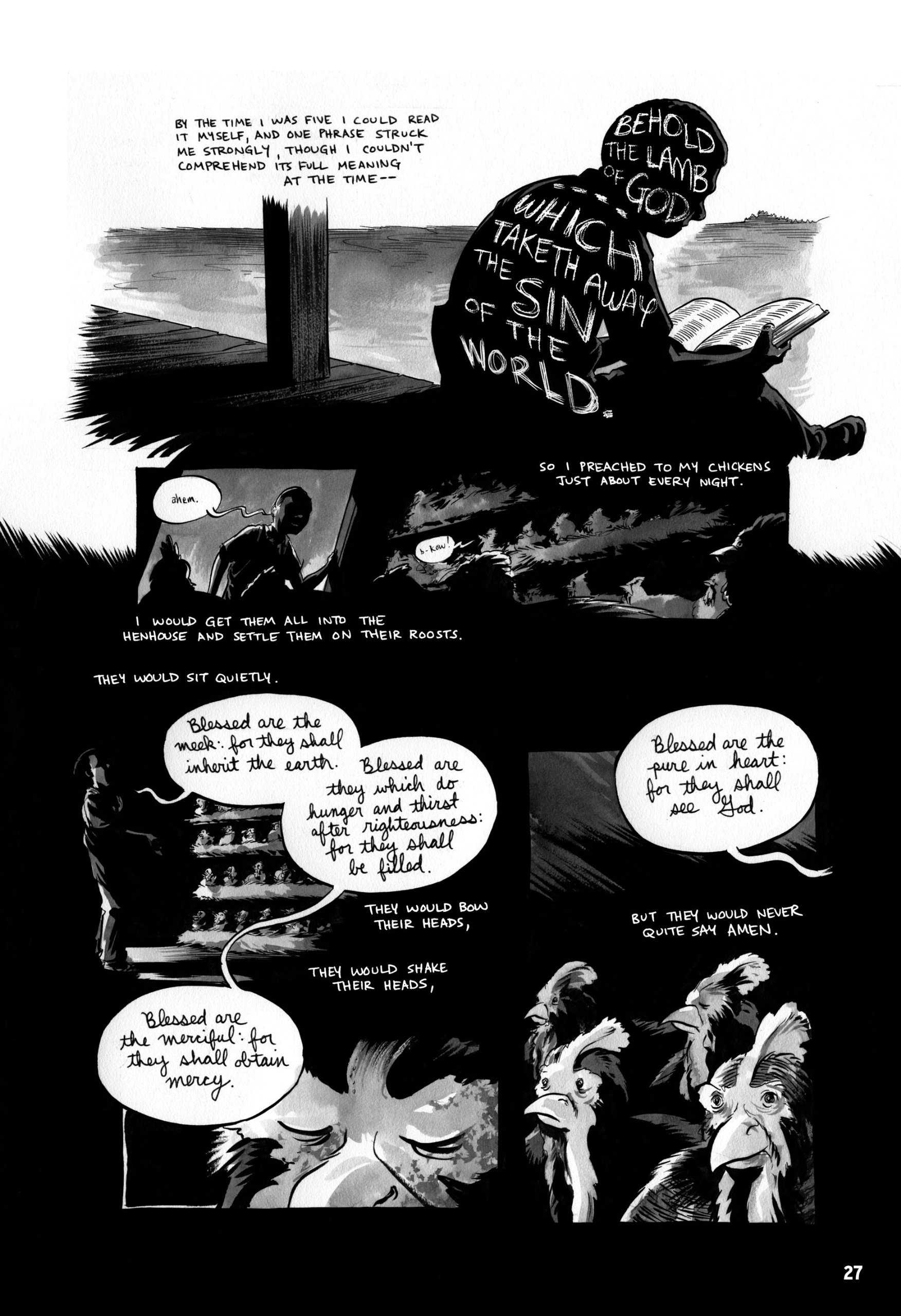
Today, the use of mixed case is often an artistic statement. Riad Sattouf’s The Arab of the Future, a memoir of the author’s childhood in Lebanon and Syria, uses a childlike sentence case for its young protagonist and all caps when excitable adults are speaking. In March, a three-part memoir co-authored by Representative John Lewis (D-Georgia) and Andrew Aydin, artist Nate Powell predominantly uses all caps, varying their size and boldface, and uses lowercase letters for child characters. The combination of these varied types urges readers to see differences in characters’ speaking styles.
And yet making more comics mixed-case—not just those looking to make an artistic statement—would involve a relatively simple set of changes that could make a difference to a large number of people, including those with dyslexia as well as visual impairments and some intellectual disabilities.
Increasingly, readers with particular needs are embracing online comics, which allow them to zoom in on panels or to enlarge speech bubbles. Enlargement can produce frustratingly low-resolution images, but there are promising tools for enlargement including Google Play Books’ Bubble Zoom, which allows readers to see an enlarged version of a single speech bubble without losing their place on the page.

(Photo: Amazon)
Still, artists and readers say digital comics could do more to help improve accessibility for readers with dyslexia and visual impairments. More vivid alternative text descriptions in online comics’ HTML could allow picture descriptions to be read aloud to blind readers with screen readers. Companies could also devise a solution to expand just the text on a Web reader, and not an entire panel. Emma Vieceli, the co-writer of the romance webcomic Breaks and other titles says that, when it comes to the potential of digital comics to meet the accessibility needs of people with visual and other impairments, “The key word is ‘potential.'”
Would-be innovators might look to the incipient projects currently helping to make reading easier for those who are blind and visually impaired for inspiration. One open-source prototype for a digital comics reader, created by Belgium’s Centre of Excellence in Information and Communication Technologies, for instance, treats the different page elements as individual files and uses an intelligent algorithm to order them sequentially depending on how the reader is accessing the comic (e.g. through voice recognition or a remote control). Another example is Comics Empower, a website that produces and sells audio comics for visually impaired people.
Bidikar thinks that, to attune the comics industry to the needs of people with reading difficulties, advocacy organizations such as those representing young people with dyslexia will have to push harder for education and reform. “I think we are bound a lot by tradition” in the industry, he says. In his experience, comics publishers only think about accessibility considerations when writing for children. “Other than that, I don’t think there are many concessions being made for people with reading disabilities, which I think is sad. … There have been a few people talking about this on and off, but no real groundswell.”


